Wednesday, 31 May 2017
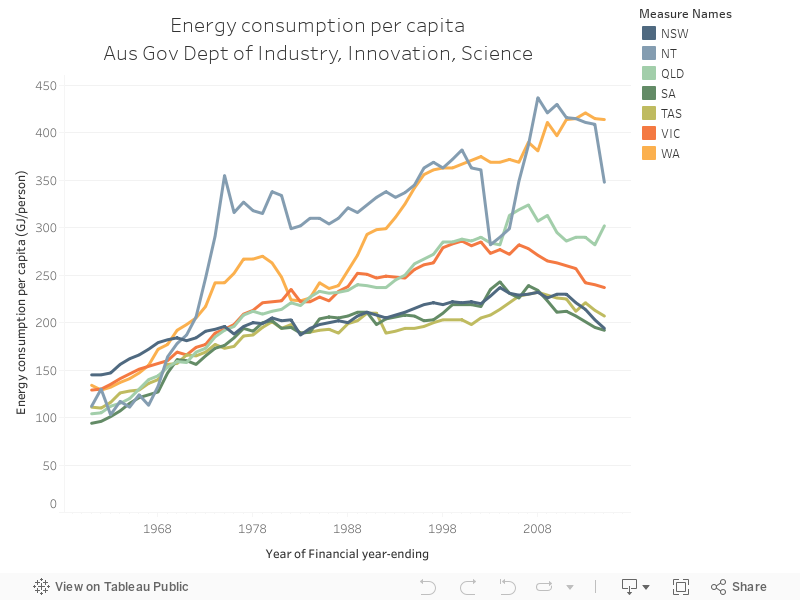
051 - Aus energy consumption per capita by state
The Office of the Chief Economist's Energy Statistics database is a comprehensive annual long-term look at Australian energy, within the Government's Department of Innovation, Industry and Science. The chart below is extracted from their 2016 report and shows total energy consumption per capita.
Tuesday, 30 May 2017
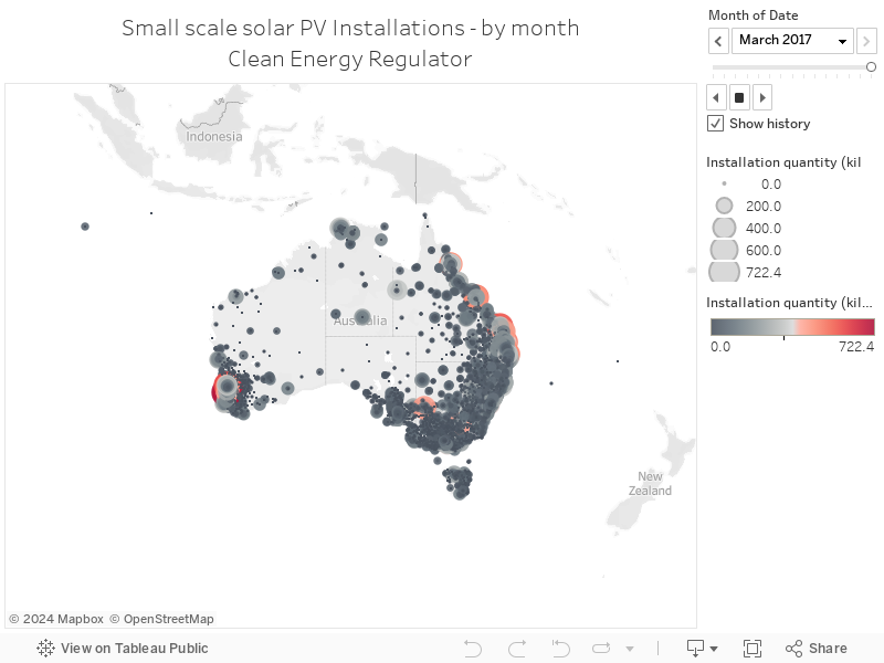
050 - Australian rooftop solar installation data - Monthly
The Clean Energy Regulator makes detailed postcode-level data on solar PV installations publicly available, and it's updated regularly. The map below shows total installations per month - you can use the month card on the right hand side to navigate:


Monday, 29 May 2017
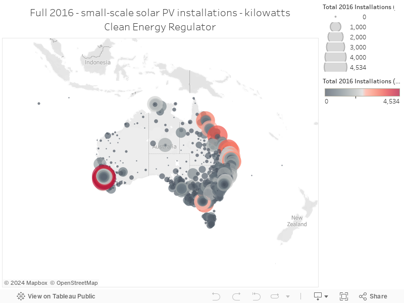
049 - Australian rooftop solar installation data - 2016
The Clean Energy Regulator makes detailed postcode-level data on solar PV installations publicly available, and it's updated regularly. The map below shows total installations for the full year of 2016 in total kilowatts:
Sunday, 28 May 2017
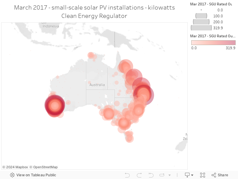
048 - Australian rooftop solar installation data - March 2017
The Clean Energy Regulator makes detailed postcode-level data on solar PV installations publicly available, and it's updated regularly. The map below shows total installations for the month of March 2017:
Thursday, 25 May 2017
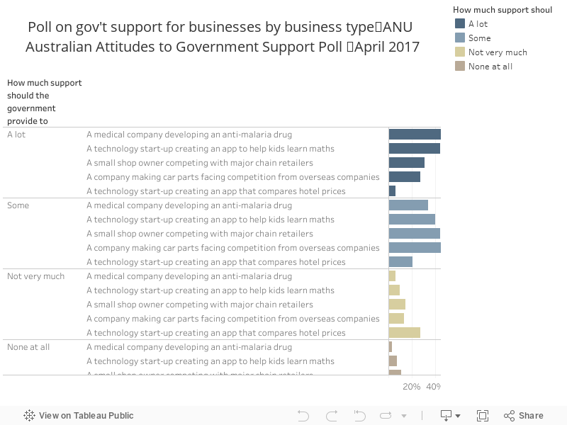
047 - ANU poll - views on gov't support by biz type
In April 2017, the Australian National University released a fascinating poll examining public attitudes to science, politics and policy in Australia. It's really interesting - the chart below shows how much the public supports government funding for private businesses, split out by different types of business.
Wednesday, 24 May 2017
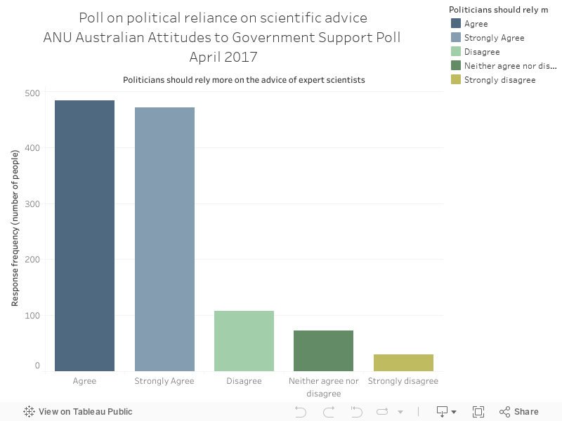
046 - ANU Poll - the public want politicians to rely more heavily on scientific evidence
In April 2017, the Australian National University released a fascinating poll examining public attitudes to science, politics and policy in Australia. It's really interesting - the chart below shows a strong majority of the public want politicians to rely more on scientific evidence:
Tuesday, 23 May 2017
045 - Potential emissions reductions from Sydney solar
A fascinating study from the Australian Solar PV Institute and UNSW, supported by the NSW government, shows the potential for solar PV in Sydney's inner city suburbs, looking at all rooftops alongside a few interesting case studies.
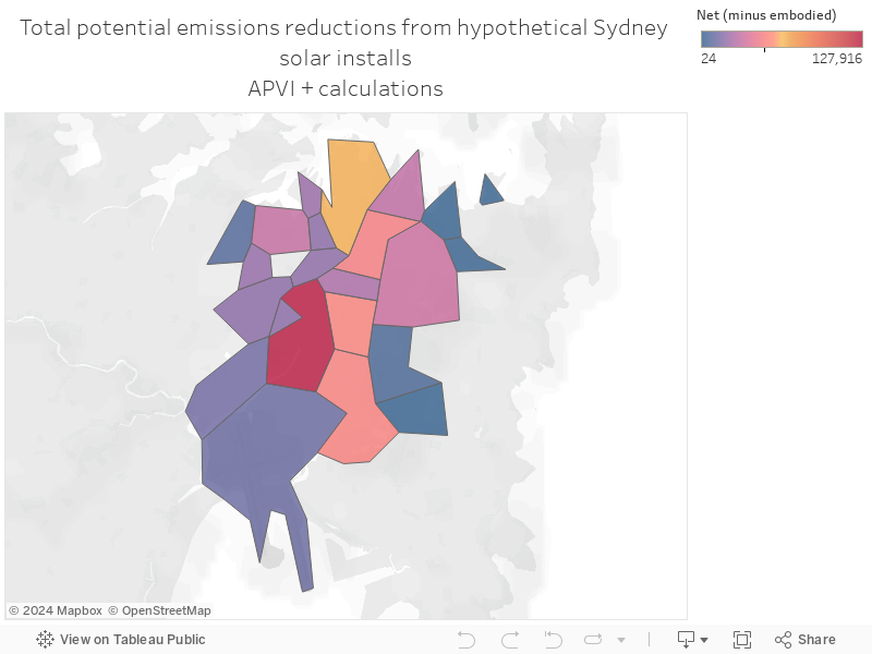
The graphic below shows a calculation I've done of potential emissions reductions from usage of the technology across Sydney's suburbs, shown as a map - I've subtracted the emissions used in the manufacture of the panels as the researchers have done in the paper.
044 - Sydney CBD's huge solar output potential
A fascinating study from the Australian Solar PV Institute and UNSW, supported by the NSW government, shows the potential for solar PV in Sydney's inner city suburbs, looking at all rooftops alongside a few interesting case studies.
The chart below shows total potential generation across the suburbs
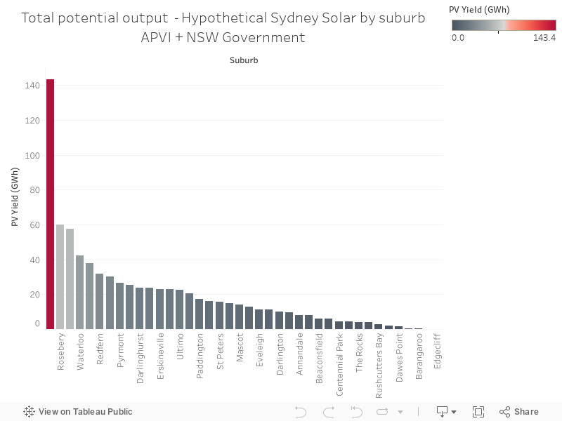
The chart below shows total potential generation across the suburbs
Sunday, 21 May 2017
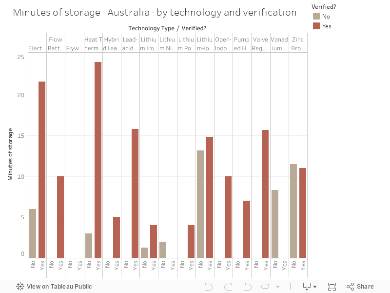
043 - Minutes of battery storage in Australia, by technology and verification status
The Energy Storage Exchange's storage database is pretty big - below, I've extracted technology type and verification status for Australia's energy storage.
Thursday, 18 May 2017
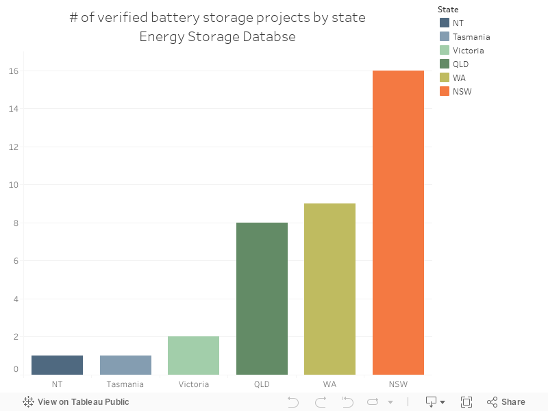
042 - Australia's energy storage projects by state
The Energy Storage Exchange's storage database is pretty big - I've sliced out Australia's storage projects and removed projects yet to be verified. Enjoy!
Wednesday, 17 May 2017
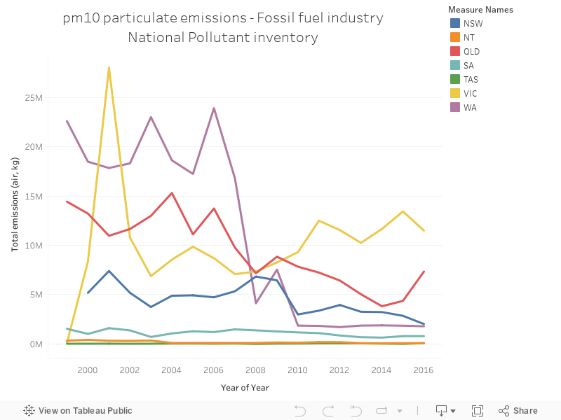
041 - PM10 emissions for fossil fuel electricity generation dominated by Victoria
The National Pollutant Inventory (NPI) is a truly gigantic dataset of air, water and land emissions from a bunch of activities in Australia. It's quite detailed - below is a chart showing PM10 emissions from fossil fuel electricity generation by state. Every state's decreasing with the exception of Victoria
Tuesday, 16 May 2017
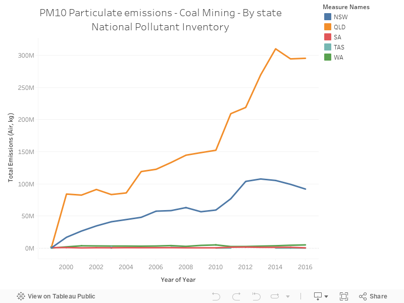
040 - Coal mining PM10 particulate emissions are rising in NSW and QLD
The National Pollutant Inventory (NPI) is a truly gigantic dataset of air, water and land emissions from a bunch of activities in Australia. It's quite detailed - below is a chart showing total PM10 air emissions from coal mining by state - obviously dominated by NSW and QLD.
Monday, 15 May 2017
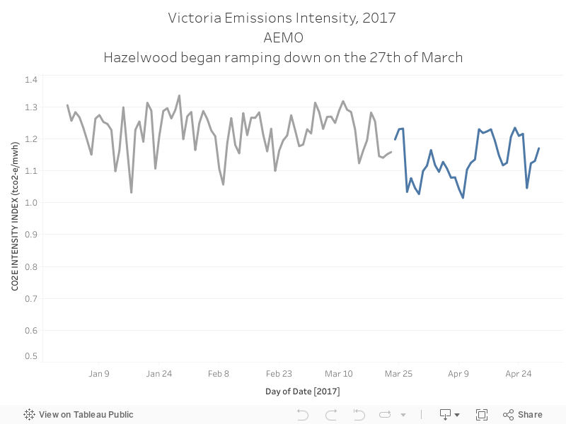
039 - Hazelwood's closure has impacted Victoria's emissions intensity
Almost all public discourse on Hazelwood's closure was about energy security and reliability - there was close to no discussion on how it'd impact emissions. Calculating the actual decrease would take some analysis, but AEMO's public emissions data shows that the intensity of emission, per unit of output, have decreased since the closure of Australia's oldest and dirtiest power station.
Sunday, 14 May 2017
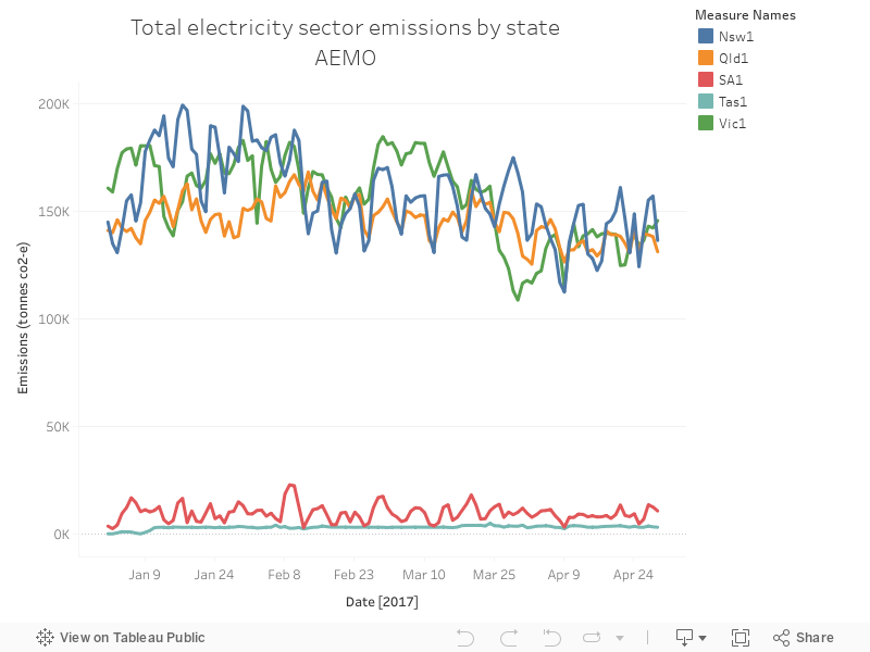
038 - NSW, QLD and Vic dominate Australia's emissions - by a lot
AEMO makes a bunch of data available on their website, freely. It's pretty good. You can download emissions data here - it shows, as you might expect, that NSW, QLD and Victoria dominate emissions - demand is the highest in these states. You can also see, in the chart below, how emissions decrease as we head into winter and air-conditioning stops pushing demand quite high.
Thursday, 11 May 2017
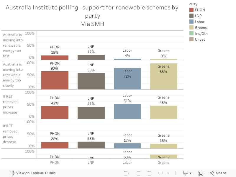
037 - Views on renewable energy by voter
A recent collection of polling from the Australia Institute highlights some interesting differences between voters on renewable energy policies. One Nation, largely considered a party of the far right, has strong support for renewable energy policies and in some cases, are stronger supporters of renewable energy than voters for the Liberal party.
Wednesday, 10 May 2017
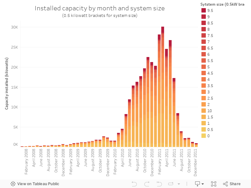
036 - Changes in installation size over the Solar Bonus Scheme
The NSW solar bonus scheme was launched in January 2010, "to encourage the uptake of renewable energy, handed homeowners 60¢ or 20¢ "feed-in" tariffs per kilowatt hour, for the solar energy they put back into the grid".
The NSW government makes data available on their website detailing installations - the chart below shows the amount of capacity installed each month, broken up by the size of the installation. Bigger installations are darker red; smaller ones are lighter.
Source.
The NSW government makes data available on their website detailing installations - the chart below shows the amount of capacity installed each month, broken up by the size of the installation. Bigger installations are darker red; smaller ones are lighter.
Source.
Tuesday, 9 May 2017
035 - The rapid uptick in solar installations under NSW's solar bonus scheme
The NSW solar bonus scheme was launched in January 2010, "to encourage the uptake of renewable energy, handed homeowners 60¢ or 20¢ "feed-in" tariffs per kilowatt hour, for the solar energy they put back into the grid".
The NSW government makes data available on their website detailing installations - the chart below shows the total capacity installed for each month in the data set.
Source.
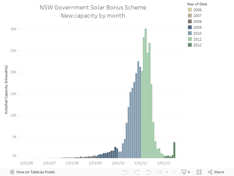
The NSW government makes data available on their website detailing installations - the chart below shows the total capacity installed for each month in the data set.
Source.
Monday, 8 May 2017
034 - UK media sentiment analysis by topic
Editorials are a useful insight into the views of those running media outlets - Carbon Brief has a good listing of editorials in the UK by topic. I ran them through a low-grade sentiment analyser - the results shouldn't be taken seriously by anyone, but it's a curious insight in the differences between different topics (yesterday's chart was by topic).
Cheers to Dr Simon Evans for the idea.
Source.
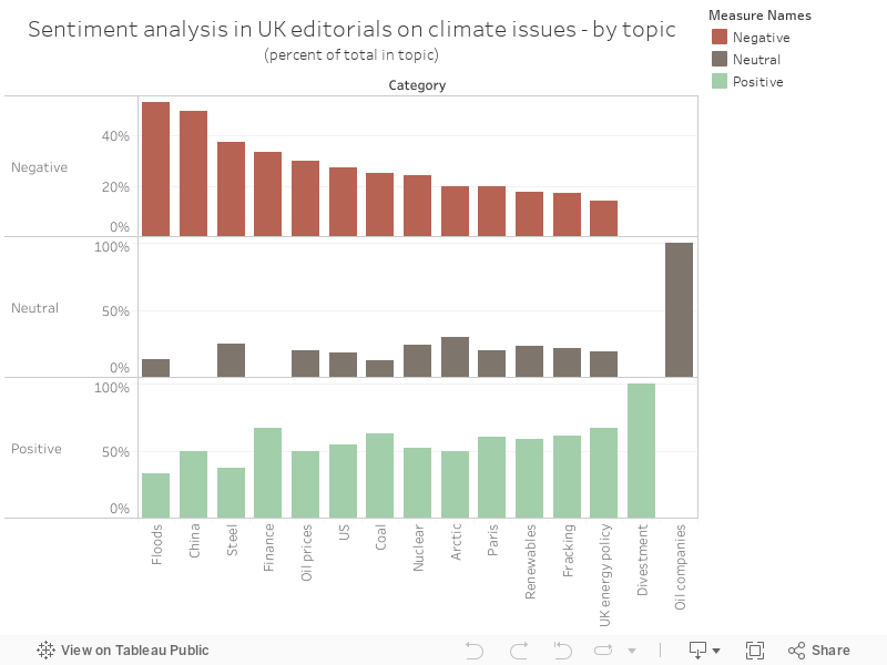
Cheers to Dr Simon Evans for the idea.
Source.
Sunday, 7 May 2017
033 - UK media sentiment analysis by outlet
Editorials are a useful insight into the views of those running media outlets - Carbon Brief has a good listing of editorials in the UK by topic. I ran them through a low-grade sentiment analyser - the results shouldn't be taken seriously by anyone (sentiment analysis can be rough around the edges), but it's a curious insight in the differences between the outlets.
Cheers to Dr Simon Evans for the idea.
Source.
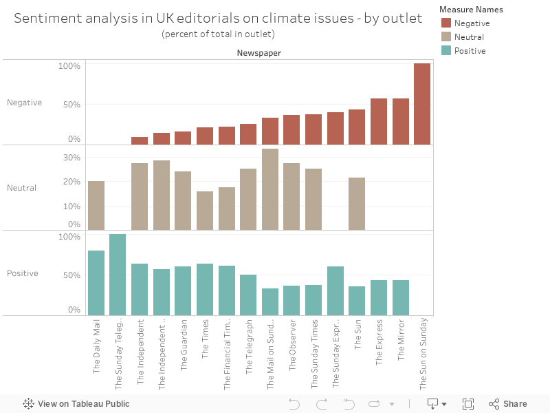
Cheers to Dr Simon Evans for the idea.
Source.
Thursday, 4 May 2017
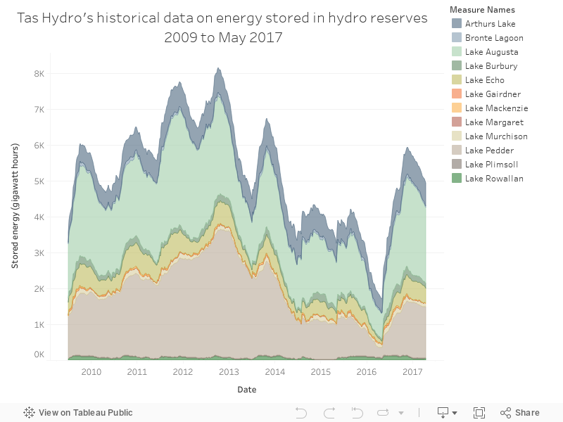
032 - Tasmania's history as a giant battery for Australia
In light of a recent announcement regarding Tasmania and hydro storage, here's a chart from Hydro Tasmania's website, showing the quantity of energy stored by the reserves in Tasmania, with a pointed drop late last year - the Tasmanian energy crisis, which coincided with the failure of an interconnector between Tasmania and the mainland.
Wednesday, 3 May 2017
031 - Those wanting a gov't shake-up also hate immigrants
A fascinating and unique statistic from the Australian Election Study 2016, via the latest Quarterly Essay - there's a strong link between those wanting a shake up of the government and those with a distinct anti-immigration sentiment.
These data are from the latest Quarterly Essay as determined by the Australian Election Study 2016 - also here
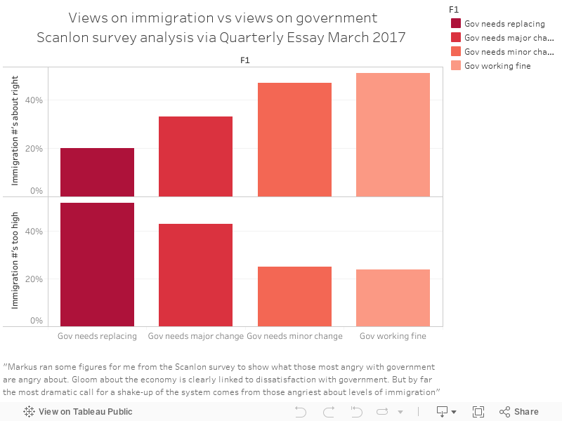
These data are from the latest Quarterly Essay as determined by the Australian Election Study 2016 - also here
Tuesday, 2 May 2017
030 - One Nation voters think immigrants are criminals who take jobs and worsen the economy
It's a fact borne out in some polling from the Australian Election Study in 2016 - a large survey that examined Australian attitudes.
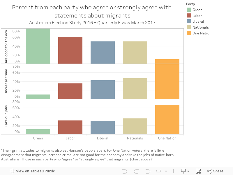
These data are from the latest Quarterly Essay as determined by the Australian Election Study 2016 - also here.
Monday, 1 May 2017
029 - More One Nation voters live in cities than you think
Though the public perception is that the majority of One Nation voters hail from rural areas, a decent chunk of them come from cities, and the outer suburbs.
These data are from the latest Quarterly Essay as determined by the Australian Election Study 2016.
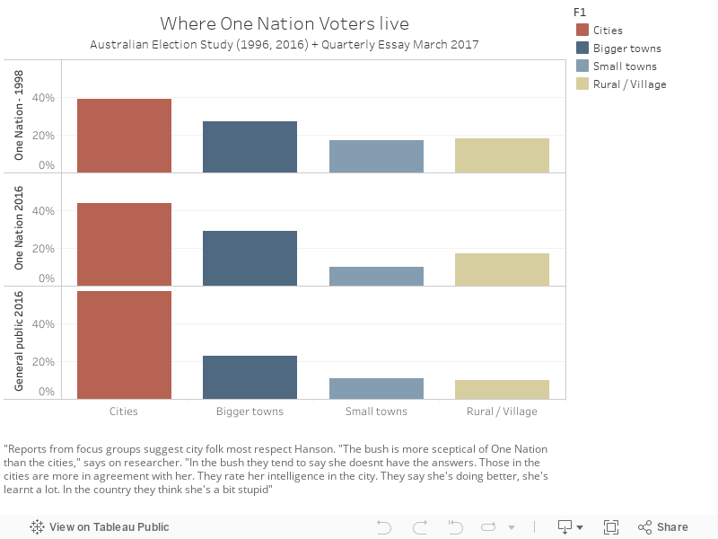
These data are from the latest Quarterly Essay as determined by the Australian Election Study 2016.
Subscribe to:
Posts (Atom)