Sunday 25 June 2017

072 - Big wind vs small sun - distribution comparison

The data below come from a great, useful piece of software called NEM-Review, which shows generation data from machines on the east coast of Australia (WA's excluded)

The chart below shows the output distribution for large-scale wind farms and rooftop solar PV. The data show the total number of half hour intervals that each technology spends at different levels of output.


071 - Large-scale PV output by day and facility

The data below come from a great, useful piece of software called NEM-Review, which shows generation data from machines on the east coast of Australia (WA's excluded)

The chart below shows the total output of large-scale solar PV output, showing average megawatt output by day.


070 - Rooftop PV output by day and state

The data below come from a great, useful piece of software called NEM-Review, which shows generation data from machines on the east coast of Australia (WA's excluded)

The chart below shows estimated rooftop PV by state - the estimations of rooftop PV output come from a tool that estimates generation from a map of suburb installations.


069 - Total week output by technology

The data below come from a great, useful piece of software called NEM-Review, which shows generation data from machines on the east coast of Australia (WA's excluded)

The chart below shows the total output of each fuel type by week, for those renewable energy generators on the NEM.


068 - Percent of total time tech online by hour

The data below come from a great, useful piece of software called NEM-Review, which shows generation data from machines on the east coast of Australia (WA's excluded).

The chart below shows the percentage of time each technology was generating more than zero megawatts, shown by each one-hour block in the day.


067 - Daily generation profile by renewable technology

The data below come from a great, useful piece of software called NEM-Review, which shows generation data from machines on the east coast of Australia (WA's excluded)

The chart below shows the daily output of Australian renewable energy technologies, by average megawatts of output.


Thursday 22 June 2017

066 - Plenty of public uncertainty on CCS

Essential vision polled survey respondents about carbon capture and storage - the 'don't knows' dominate and there's an expected political voting divide on views on the technology. This is a very hot issue at the moment, with the Minerals Council of Australia urging the Australian government to use taxpayer funds to build new coal-fired power stations.


Wednesday 21 June 2017

065 - The public like a clean energy target (but are still confused about it all)

Essential Vision polled survey respondents on their views about a clean energy target scheme and an emissions intensity scheme - people like a CET but there's plenty of don't knows about both.


Tuesday 20 June 2017

064 - Australian air-conditioner usage map

This great data set shows total hours of cooling and heating in Australia over the course of a year, available here. Its sorted by postcode, so I've made them into a map below.


Monday 19 June 2017

063 - Emissions reductions potential from Vic hot water

More data from Aus gov's great open data site - "Using data from the Bureau of Meteorology and figures from the Climate Group, the Solar Report shows the percentage cost and greenhouse gas emissions that households in Victorian regions would save on their hot water bill if they had a solar water heater"

The chart below shows emissions reductions in the total number of cars that could be taken off the road.


Sunday 18 June 2017

062 - The potential savings from new solar hot water in Victoria

More data from Aus gov's great open data site - "Using data from the Bureau of Meteorology and figures from the Climate Group, the Solar Report shows the percentage cost and greenhouse gas emissions that households in Victorian regions would save on their hot water bill if they had a solar water heater"

Go Mildura!

Thursday 15 June 2017

061 - Emissions intensity of new NEM generators

The Australian Electricity Market Operator has a database called the National Transmission Network Development Plan (NTNDP) database - the NTNDP is basically a report that looks at what future grid wires might look  like. There are some detailed, fascinating data points underneath this report.

The chart below shows emissions intensity for new power stations - measured in the tonnes of greenhouse gases emitted for every megawatt hour of generation.


Wednesday 14 June 2017

060 - Thermal efficiency

The Australian Electricity Market Operator has a database called the National Transmission Network Development Plan (NTNDP) database - the NTNDP is basically a report that looks at what future grid wires might look  like. There are some detailed, fascinating data points underneath this report.

The chart below shows the thermal efficiency for new power stations in Australia - it's measured in HHV - "High heating value". This is, basically, how much you get out, relative to what you put in.

Tuesday 13 June 2017

059 - Scope 1 emissions intensity for

The Australian Electricity Market Operator has a database called the National Transmission Network Development Plan (NTNDP) database - the NTNDP is basically a report that looks at what future grid wires might look  like. There are some detailed, fascinating data points underneath this report.

The chart below shows emissions intensity - the numbers of tonnes of greenhouse gases that are emitted for every megawatt hour of generation from power stations - by state, and by individual power plants.

Monday 12 June 2017

058 - Everyone's accepting climate (but polarisation is still a thing)

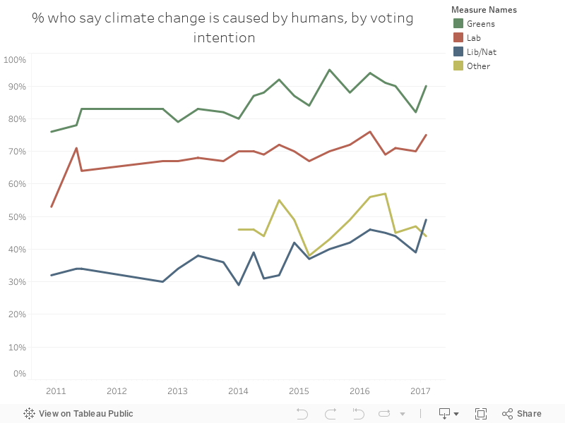
I've been collecting Essential Vision's data on climate science acceptance for quite some time - the data set's here. I recently added a second section tracking the % of people who concur with the scientific view, by party voting preference.

There's no decrease in polarisation - the gap between parties has remained roughly equal. But every single party has seen an increased percentage of people accepting the science.

The only recent decrease has been in the 'other' vote - for the first time on record, Liberal party voters are more likely to accept climate science than minor party voters.

Friday 9 June 2017

057 - French non-nuclear output distribution

The website Gridwatch makes real-time data available on UK electricity output - I recently discovered French data on there too! You can access it here. France's grid is dominated by nuclear but has a large quantity of electricity exports and imports. The data below are from 20/11/2014 16:45
 to 28/05/2017 7:45, local French time. 

The charts below show power output averaged over that time period, for each 15 minute interval throughout an average day. You can view the data with and without nuclear (to get a closer look at the profiles of the other forms of generation). 


Wednesday 7 June 2017

056 - French wind vs UK Wind - distribution

The website Gridwatch makes real-time data available on UK electricity output - I recently discovered French data on there too! You can access it here. France's grid is dominated by nuclear but has a large quantity of electricity exports and imports. The data below are from 20/11/2014 16:45
 to 28/05/2017 7:45, local French time.

The chart below is a comparison of the UK's wind power profile, compared to France's wind power profile (the UK data are from this post). 


Tuesday 6 June 2017

055 - French grid data - output by fuel type

The website Gridwatch makes real-time data available on UK electricity output - I recently discovered French data on there too! You can access it here. France's grid is dominated by nuclear but has a large quantity of electricity exports and imports. The data below are from 20/11/2014 16:45
 to 28/05/2017 7:45, local French time. 

The chart below shows output by fuel type over the period. Enjoy! 


Monday 5 June 2017

054 - Coal production by state

The Australian Department of Industry, Innovation and Science makes a yearly energy statistics report available on their website here. It's full of interesting stuff - below is a selection showing total coal production by state (black and brown). Check the website for some caveats on coal definitions by state.


Sunday 4 June 2017

053 - Australian renewable generation - wind is catching up with hydro

The Australian Department of Industry, Innovation and Science makes a yearly energy statistics report available on their website here. It's full of interesting stuff - below is a selection showing total Australian renewable energy output.


Thursday 1 June 2017

052 - Aus energy intensity by state

The Office of the Chief Economist's Energy Statistics database is a comprehensive annual long-term look at Australian energy, within the Government's Department of Innovation, Industry and Science. The chart below is extracted from their 2016 report and shows total energy intensity - the number of gigajoules consumed per unit of Gross State Product (GSP).