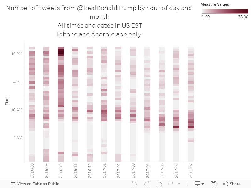
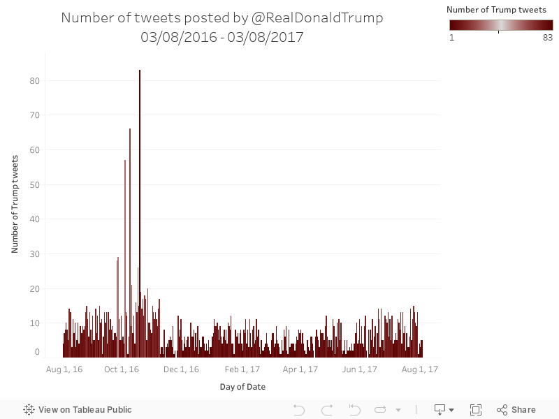
- All the charts are in United States Eastern Standard Time
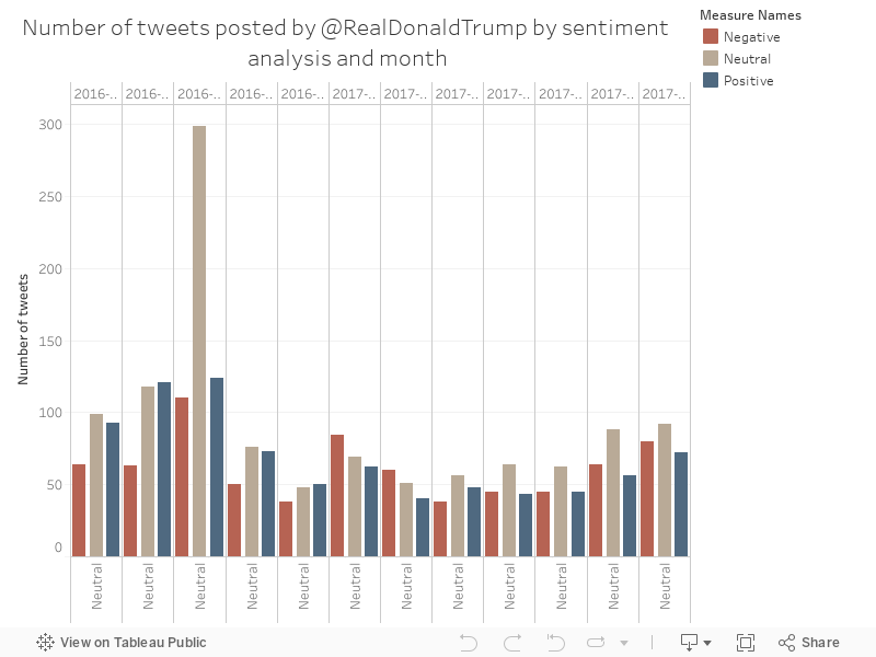
- Sentiment analysis is approximate, but interesting
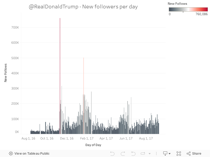
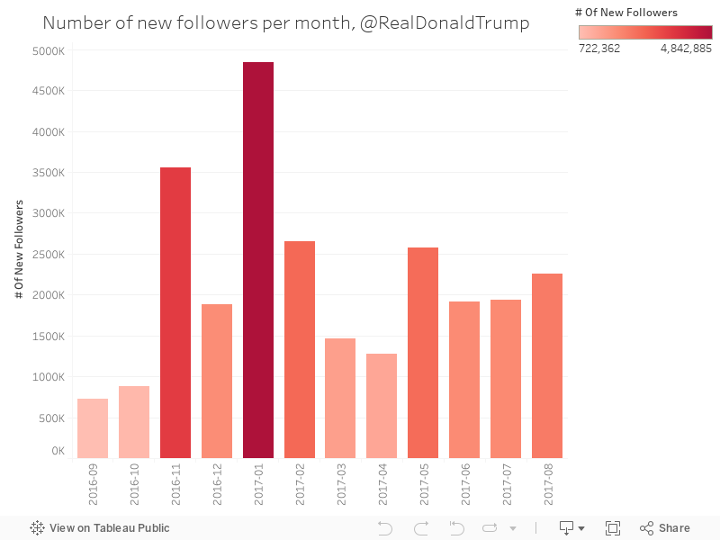
- The election was on 09/11/2016
- Trump was sworn in on 20/01/2017
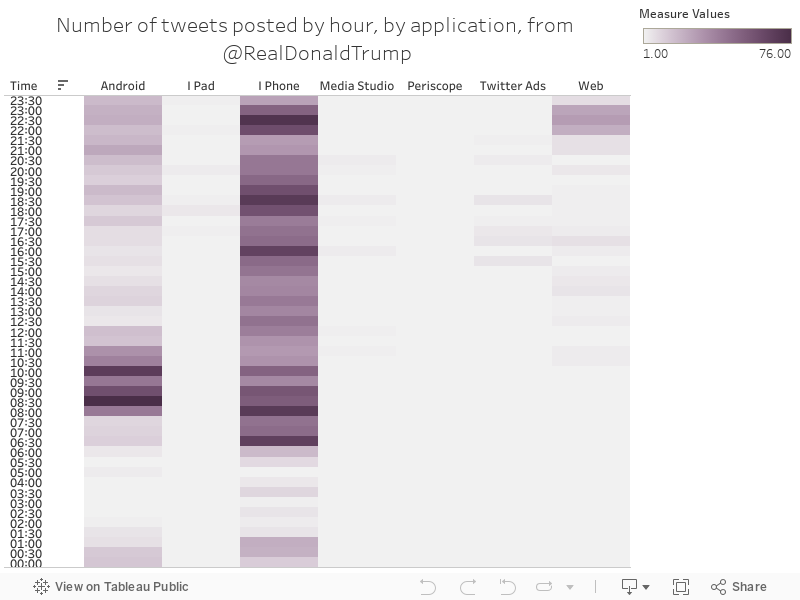
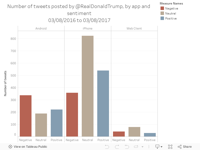
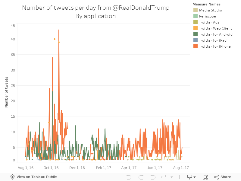
- For a long time, Trump was tweeting from his own Android phone - this seemed to completely stop around March 2017. Before that happened, we could draw some interesting insights from the app that the tweets came from
- Most of these charts show a full year, 03/08/2016 to 03/08/2017, unless shown or stated otherwise.
The chart below shows the number of tweets posted by half-hour chunks, sorted by app - with Android tweets coming earlier in the morning and iPhone tweets spread quite equally.