Showing posts with label AEMO. Show all posts

Wednesday, 23 August 2017

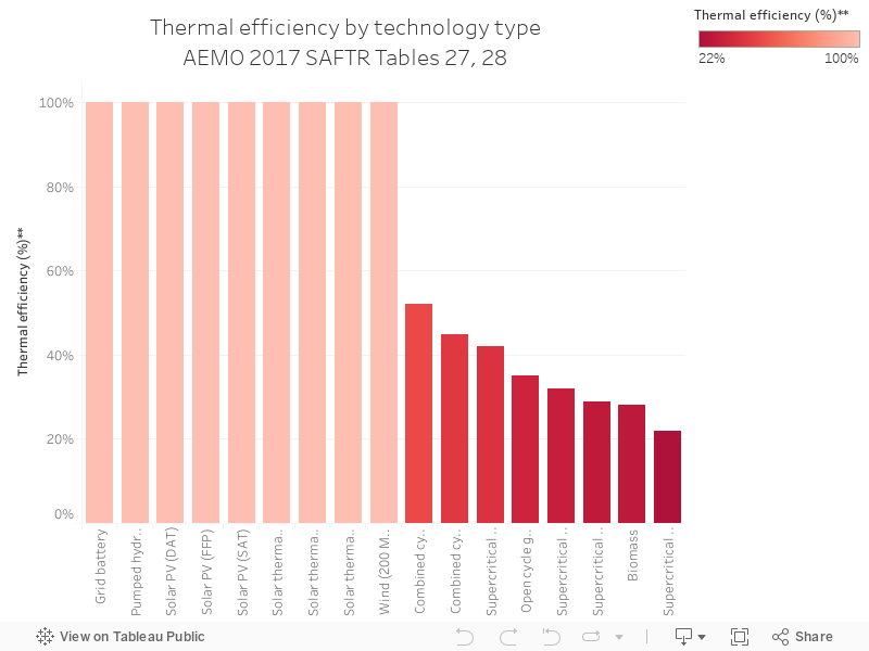
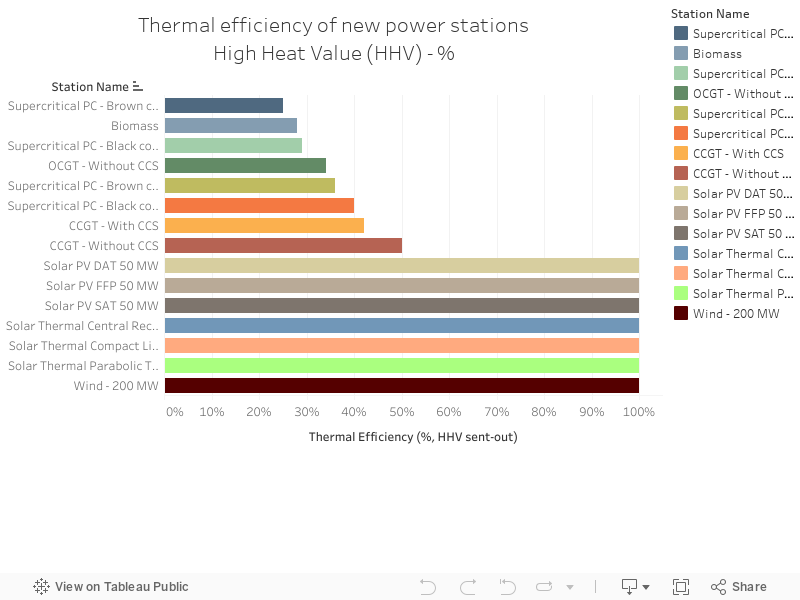
120 - 2017 Thermal efficiency by technology

Charts 116 through to 120 are a series from the Australian Energy Market Operator's South Australian Fuel and Technology Report, 2017, which can be accessed here.

The chart below shows the thermal efficiency of different technologies (sent out high heating value, HHV), which is basically how efficient the machine is at converting fuel to output.


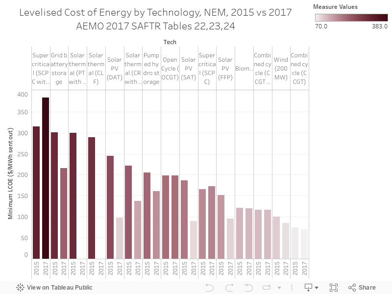
119 - Tech min LCoE, 2015 vs 2017

Charts 116 through to 120 are a series from the Australian Energy Market Operator's South Australian Fuel and Technology Report, 2017, which can be accessed here.

The chart below shows the levelised cost of energy (LCoE) by technology, comparing 2015 to 2017. Grid battery storage is up the top, but it's also seen the biggest drop in cost in two years out of all technologies.


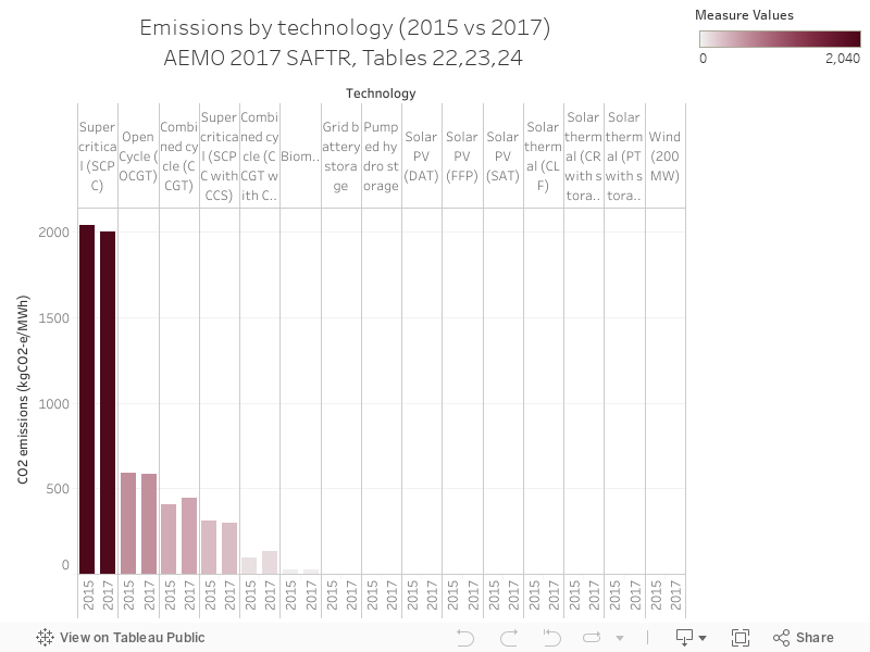
118 - Tech emissions, 2015 vs 2017

Charts 116 through to 120 are a series from the Australian Energy Market Operator's South Australian Fuel and Technology Report, 2017, which can be accessed here.

Today's chart shows emissions intensity for every unit of ouput by technology, with super-critical coal at the top of the the list.

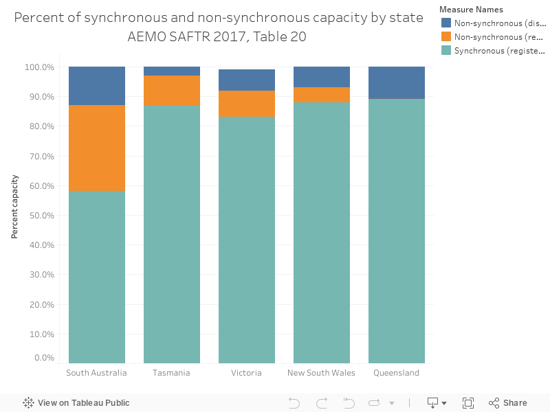
117 - Installed capacity by physical attributes, NEM as at June2016

Charts 116 through to 120 are a series from the Australian Energy Market Operator's South Australian Fuel and Technology Report, 2017, which can be accessed here.

The chart below shows the spread of synchronous and non-synchronous generation across NEM regions, with SA having the highest proportion of non-synchronous generation.

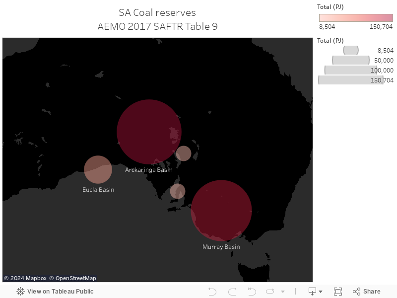
116 - SA Coal resources map

Charts 116 through to 120 are a series from the Australian Energy Market Operator's South Australian Fuel and Technology Report, 2017, which can be accessed here.

The chart below shows South Australia's coal reserves, Table 9 in the report.

Thursday, 15 June 2017

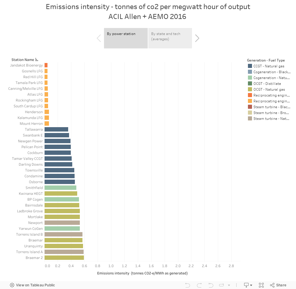
061 - Emissions intensity of new NEM generators

The Australian Electricity Market Operator has a database called the National Transmission Network Development Plan (NTNDP) database - the NTNDP is basically a report that looks at what future grid wires might look  like. There are some detailed, fascinating data points underneath this report.

The chart below shows emissions intensity for new power stations - measured in the tonnes of greenhouse gases emitted for every megawatt hour of generation.


Wednesday, 14 June 2017

060 - Thermal efficiency

The Australian Electricity Market Operator has a database called the National Transmission Network Development Plan (NTNDP) database - the NTNDP is basically a report that looks at what future grid wires might look  like. There are some detailed, fascinating data points underneath this report.

The chart below shows the thermal efficiency for new power stations in Australia - it's measured in HHV - "High heating value". This is, basically, how much you get out, relative to what you put in.

Tuesday, 13 June 2017

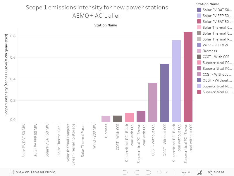
059 - Scope 1 emissions intensity for

The Australian Electricity Market Operator has a database called the National Transmission Network Development Plan (NTNDP) database - the NTNDP is basically a report that looks at what future grid wires might look  like. There are some detailed, fascinating data points underneath this report.

The chart below shows emissions intensity - the numbers of tonnes of greenhouse gases that are emitted for every megawatt hour of generation from power stations - by state, and by individual power plants.

Monday, 15 May 2017

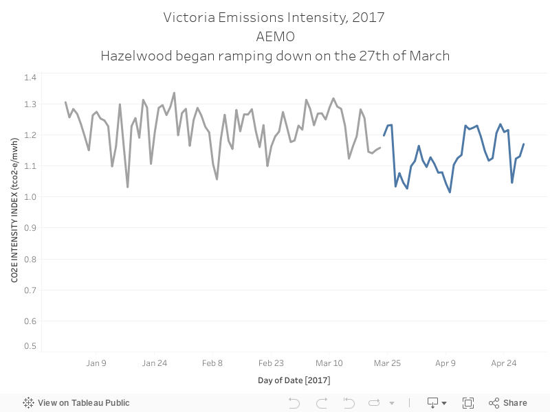
039 - Hazelwood's closure has impacted Victoria's emissions intensity

Almost all public discourse on Hazelwood's closure was about energy security and reliability - there was close to no discussion on how it'd impact emissions. Calculating the actual decrease would take some analysis, but AEMO's public emissions data shows that the intensity of emission, per unit of output, have decreased since the closure of Australia's oldest and dirtiest power station.


Sunday, 14 May 2017

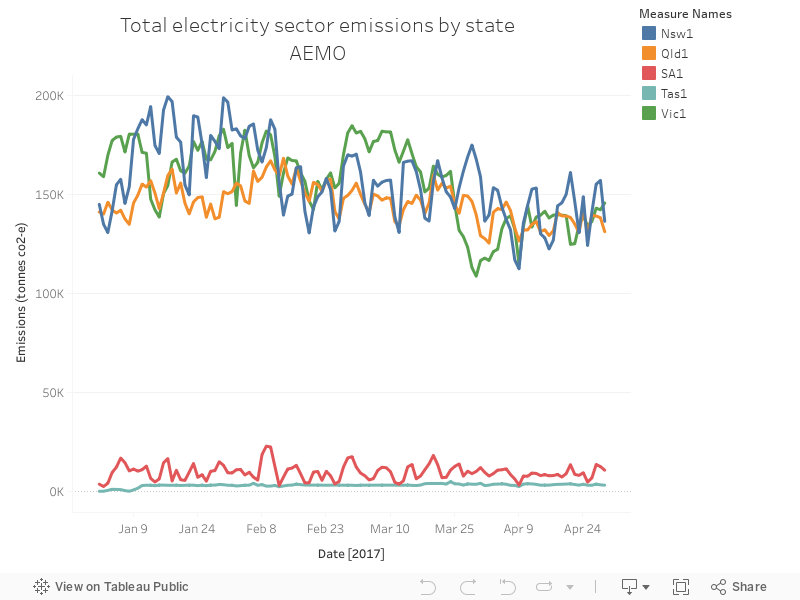
038 - NSW, QLD and Vic dominate Australia's emissions - by a lot

AEMO makes a bunch of data available on their website, freely. It's pretty good. You can download emissions data here  - it shows, as you might expect, that NSW, QLD and Victoria dominate emissions - demand is the highest in these states. You can also see, in the chart below, how emissions decrease as we head into winter and air-conditioning stops pushing demand quite high.