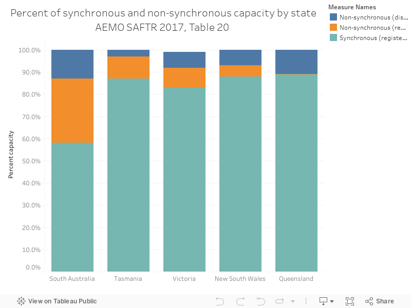
Charts 116 through to 120 are a series from the Australian Energy Market Operator's South Australian Fuel and Technology Report, 2017, which can be accessed here.
The chart below shows the spread of synchronous and non-synchronous generation across NEM regions, with SA having the highest proportion of non-synchronous generation.