Showing posts with label NEM-Review. Show all posts

Sunday, 13 August 2017

105 - Higher wind output in SA correlates with lower wholesale price

This week, a series on South Australia - all using data from Global Roam's excellent NEM Review software, which you can purchase here.

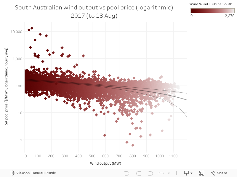
Today's chart is similar to yesterday's - it shows the relationship between wind power output and wholesale price in South Australia. Unlike yesterday's chart on gas, wind has the opposite effect - as you get more wind power output in each interval, the price ends up lower. This is because wind introduces more competition, has no fuel costs, and also receives revenue from the Renewable Energy Target (RET) scheme - all of these factors mean wind's increasing output results in lower wholesale price in SA. 

This is good, but obviously the impact varies with wind power output in the state. Once wind starts being paired with firming output - including storage technologies - we're going to see some very big changes in this dynamic. Obviously, wind will be slightly more expensive, but at the same time, it'll be dispatchable - and perhaps, as battery costs fall, it might end up even cheaper. Good times. 

104 - Higher gas output in SA correlates with higher wholesale price

This week, a series on South Australia - all using data from Global Roam's excellent NEM Review software, which you can purchase here.

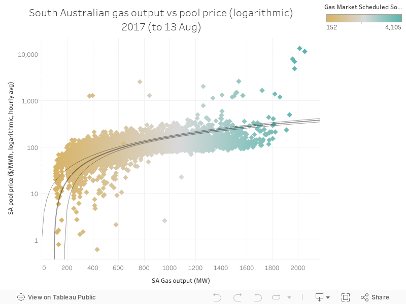
Today's chart shows the relationship between the output of gas-fired power stations in South Australia, and the wholesale pool price in the same state. The data below show a scatter plot between gas and price for ever hour in 2017, and it illustrates the simple fact that as gas power increases penetration in the state, the pool price is higher. This is because price is set by a bidding system, and the final bidder sets the price. Gas has something of a monopoly in the state, in addition to the fuel costs being high because gas is mostly exported (leaving domestic reserves more expensive).

103 - SA's significant shift to exporting to Victoria

This week, a series on South Australia - all using data from Global Roam's excellent NEM Review software, which you can purchase here.

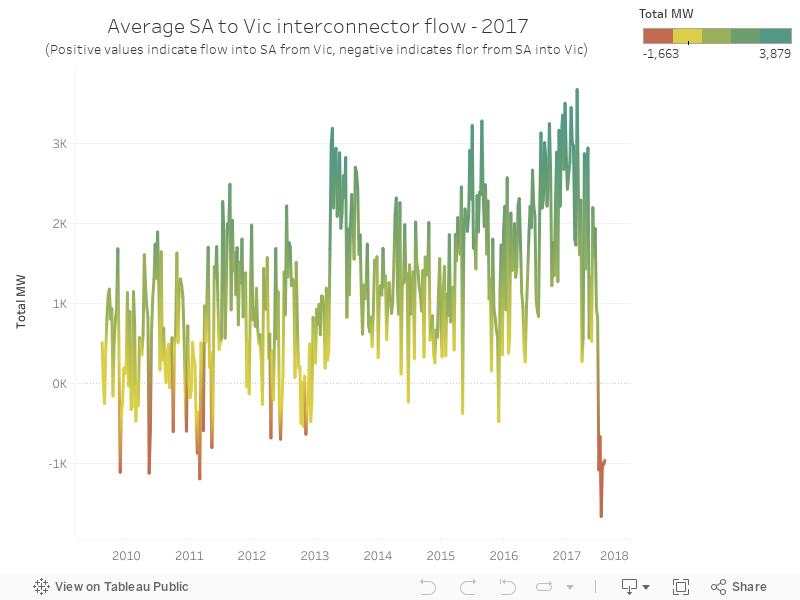
Today's chart shows the net flow across South Australia's two interconnectors (Heywood and Murraylink), and how, in recent weeks, there's been a fairly significant shift in that flow - South Australia is now exporting a fair percentage of its power to Victoria. The state hasn't exported this amount since at least 2010, and if you go back further I suspect its been quite some time since the level of net export was sustained at this level. 

This is largely related to a big upswing in wind power output, which is also at historically high levels (as is often the case in June / July). 

102 - South Australia's wholesale price changes in 2017

This week, a series on South Australia - all using data from Global Roam's excellent NEM Review software, which you can purchase here.

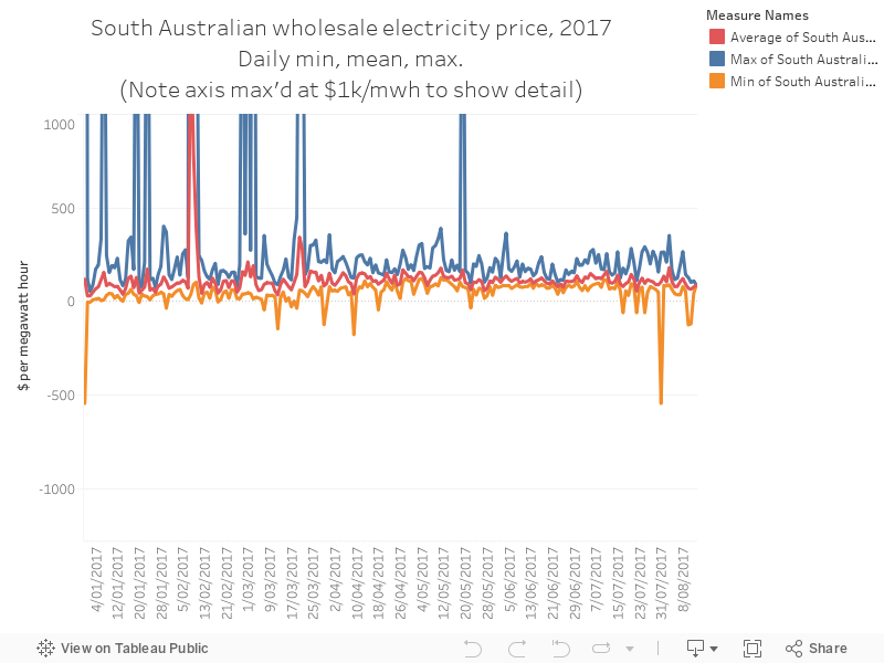
Today's chart shows the daily minimum, mean and maximum (the chart cuts off at $1,000 per megawatt hour to give us a better view of what's going on at lower price levels) wholesale electricity price in South Australia. Wholesale isn't the whole story - you also pay network, retail and environmental charges on your bill, and often fluctuations in these tell a more complete story about what you pay every quarter. 

The chart below shows how there's been a slight dip as wind power has increased output in July (as you can see in yesterday's chart), and how prices were higher when gas dominated the fuel mix in the state. You can also see the prevalence of price spikes above $1k/MWh in summer, which is pretty normal.

101 - South Australia's shifting fuel mix

This week, a series on South Australia - all using data from Global Roam's excellent NEM Review software, which you can purchase here.

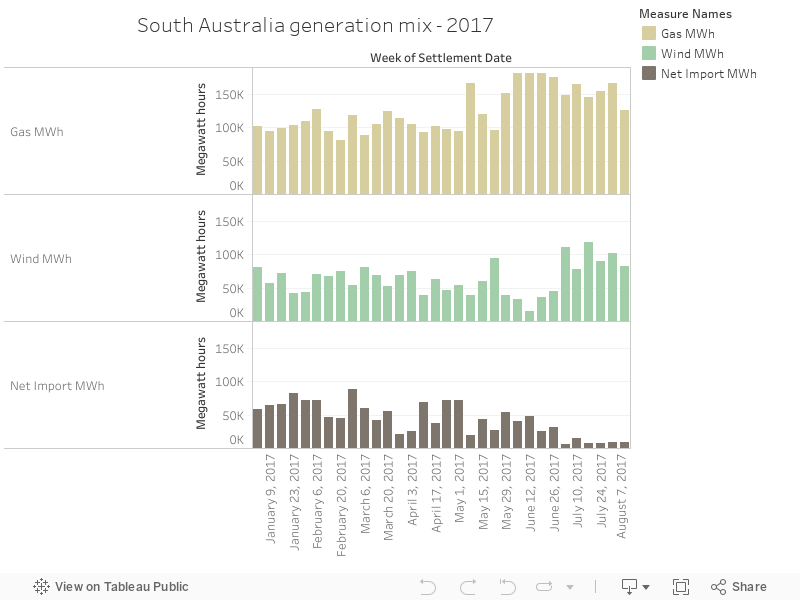
Today's chart is a simple illustration of shifts in the fuel mix so far - interestingly, after a low-wind month in June, July's high wind output means very little reliance on Victorian imports and lower exposure to high-priced gas in SA. This illustrates the advantages of wind power but it also shows the un-realised further benefits of firmed wind power - once you start dispatching low-cost resource, it'll reduce reliance on Victoria, add grid stability and also, quite importantly, reduce the amount of gas being dispatched in the state, resulting in (presumably) lower prices. 


Thursday, 13 July 2017

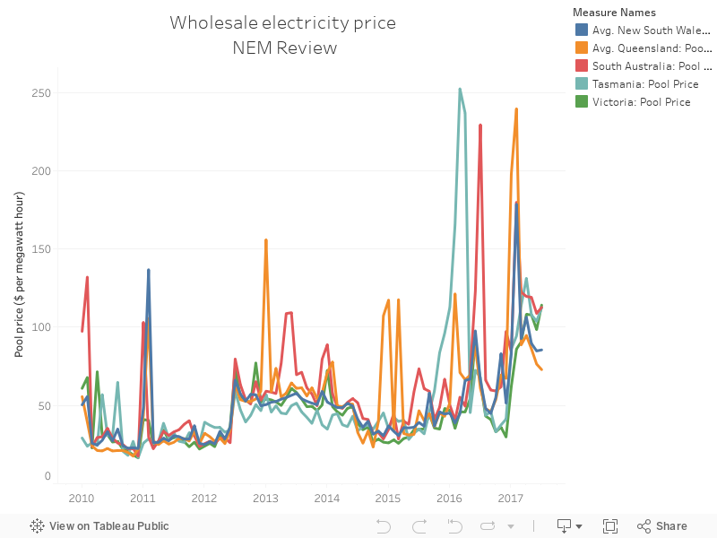
081 - Wholesale price history, NEM

A simple monthly average by state, showing wholesale electricity price. The trends are clear, and there's not a huge amount of variation between the states.


Sunday, 25 June 2017

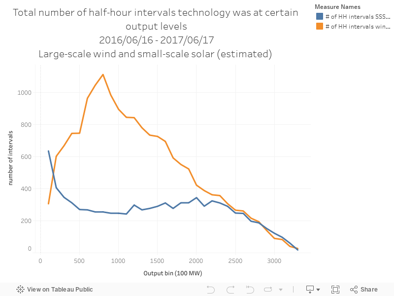
072 - Big wind vs small sun - distribution comparison

The data below come from a great, useful piece of software called NEM-Review, which shows generation data from machines on the east coast of Australia (WA's excluded)

The chart below shows the output distribution for large-scale wind farms and rooftop solar PV. The data show the total number of half hour intervals that each technology spends at different levels of output.


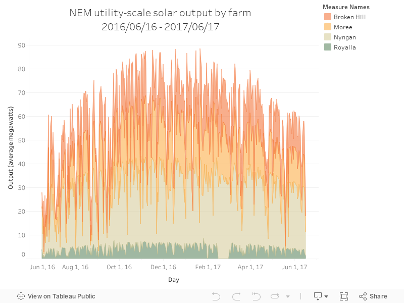
071 - Large-scale PV output by day and facility

The data below come from a great, useful piece of software called NEM-Review, which shows generation data from machines on the east coast of Australia (WA's excluded)

The chart below shows the total output of large-scale solar PV output, showing average megawatt output by day.


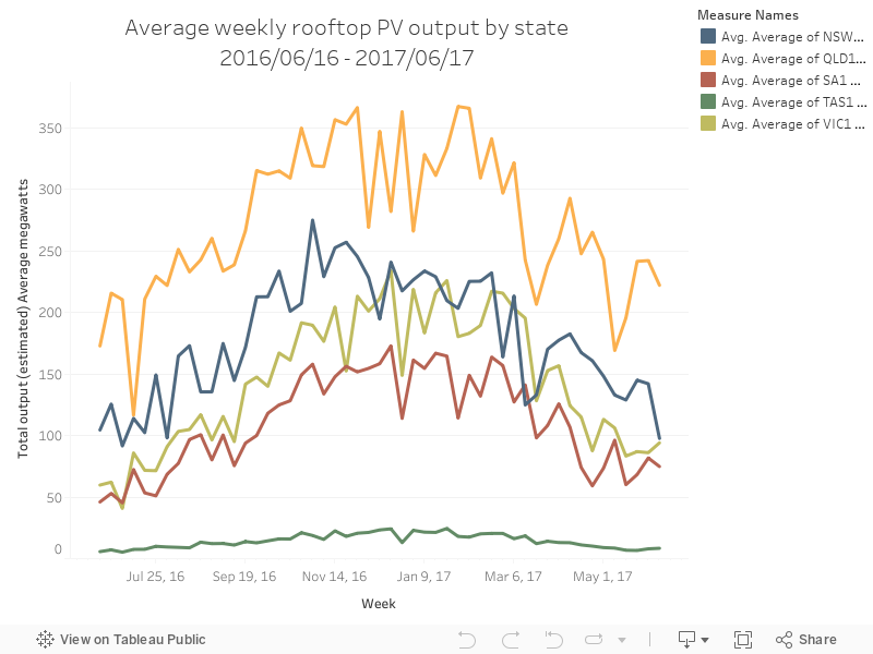
070 - Rooftop PV output by day and state

The data below come from a great, useful piece of software called NEM-Review, which shows generation data from machines on the east coast of Australia (WA's excluded)

The chart below shows estimated rooftop PV by state - the estimations of rooftop PV output come from a tool that estimates generation from a map of suburb installations.


069 - Total week output by technology

The data below come from a great, useful piece of software called NEM-Review, which shows generation data from machines on the east coast of Australia (WA's excluded)

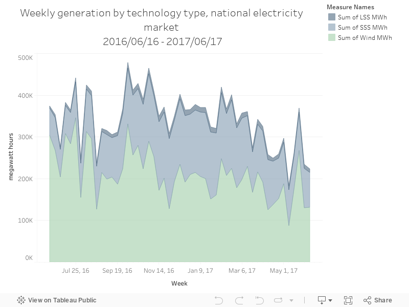
The chart below shows the total output of each fuel type by week, for those renewable energy generators on the NEM.


068 - Percent of total time tech online by hour

The data below come from a great, useful piece of software called NEM-Review, which shows generation data from machines on the east coast of Australia (WA's excluded).

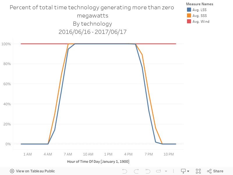
The chart below shows the percentage of time each technology was generating more than zero megawatts, shown by each one-hour block in the day.


067 - Daily generation profile by renewable technology

The data below come from a great, useful piece of software called NEM-Review, which shows generation data from machines on the east coast of Australia (WA's excluded)

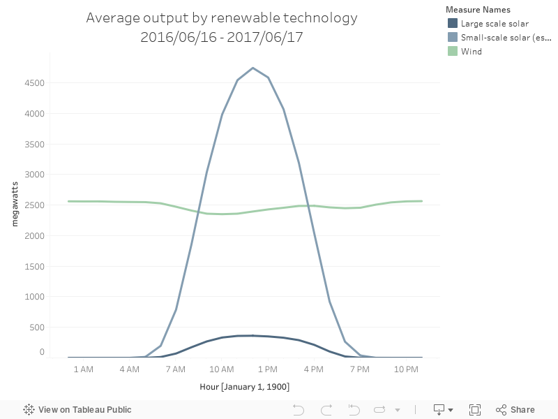
The chart below shows the daily output of Australian renewable energy technologies, by average megawatts of output.


Wednesday, 12 April 2017

019 - SA - output by fuel type

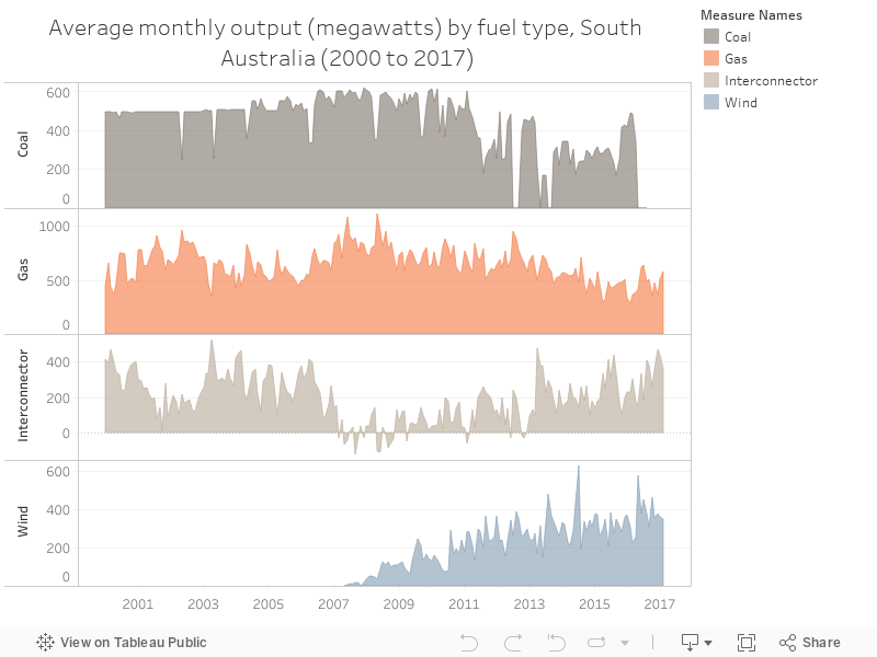
A simple chart below showing the average monthly output of South Australia sources of electricity, in megawatts, for the decade and a half (ish) - notable for the decline of coal, upswing of wind and up and down of interconnector flows. Source - NEM-Review.


Sunday, 2 April 2017

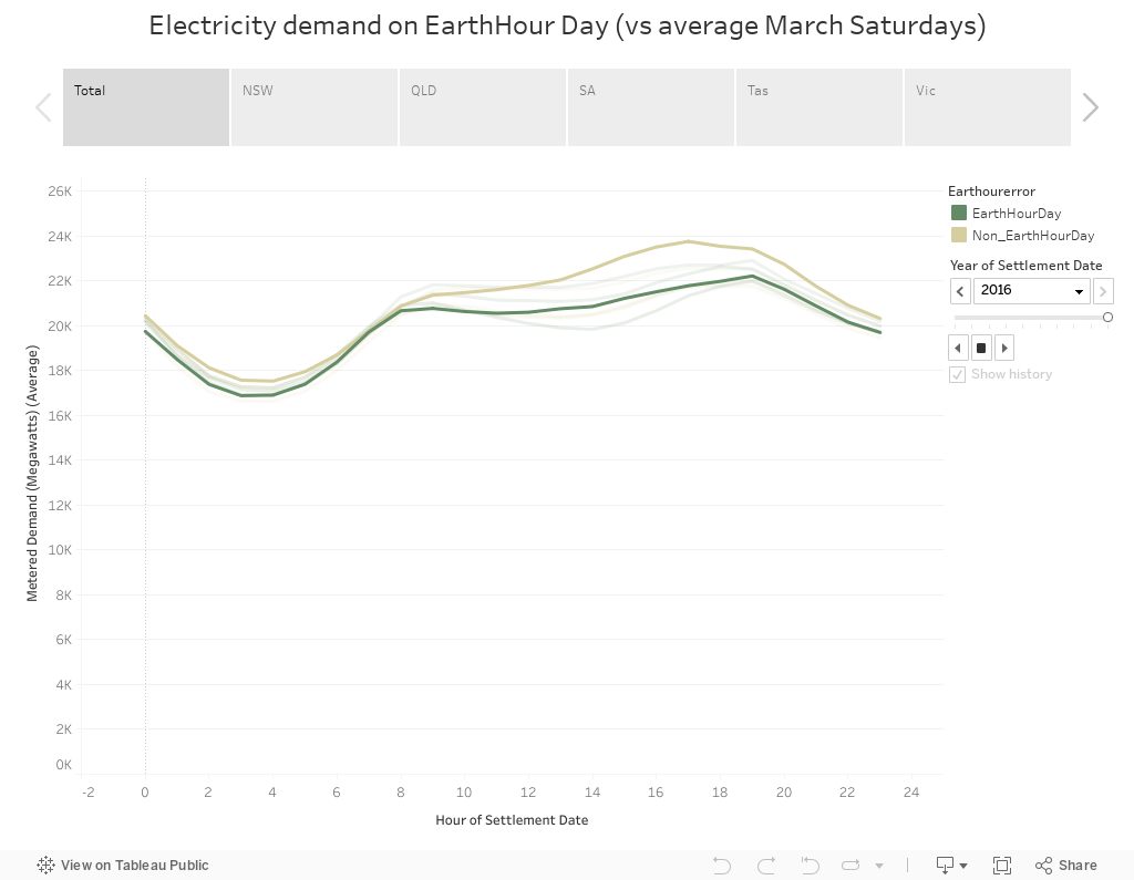
011 - Earth hour's impact across the states and the years

Earth hour saw its tenth year - a popular event, but one that's been under increasing scrutiny since it's inception in 2007.

The chart below shows demand, either by total for the NEM or state-by-state, for each earth-hour day in those past ten years, compared to the average March Saturday for that year. In some instances, total demand during the day is lower than the average - but impact on demand during the designated hour is usually hard to detect - which reinforces the symbolic nature of the event. Data via NEM-Review.


Monday, 27 March 2017

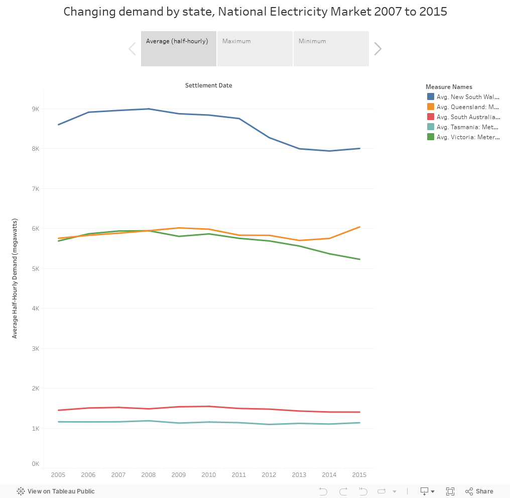
007 - Decreasing demand in the National Electricity Market - but peaks haven't changed that much

How has demand changed in the Australian NEM over the past few years? The chart below splits that up by state, and includes minimum and maximum half-hourly demand for each year. Read the market operator's demand forecasting report here - data below via NEM-review, Demand is down, but the maximums haven't changed to quite the same degree.


Wednesday, 22 March 2017

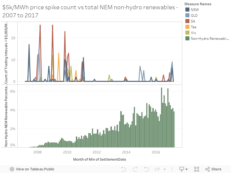
004 - Price Spikes vs RE Power percentage

There's been plenty of coverage of electricity prices and regional electricity issues - I thought I'd draw up the number of price spikes where trading interval (half-hour average price) was above $5,000 per megawatt hour over the past decade (ish), and compare it to the (still relatively small) penetration of non-hydro renewable (solar, wind) in the National Electricity Market. (Data extracted from the excellent NEM-Review software)

Tuesday, 21 March 2017

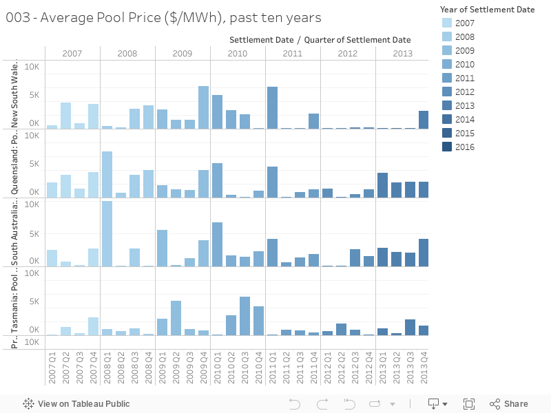
003 - NEM Pool prices over the past ten years

Wholesale electricity price, just one component of many that make up your retail bill, is separate for each region in the National Electricity Market - the chart  below shows average quarterly pool price over the past yen years. Courtesy of NEM-Review.


Monday, 20 March 2017

002 - Changes in NEM generation over the past ten years (ish)

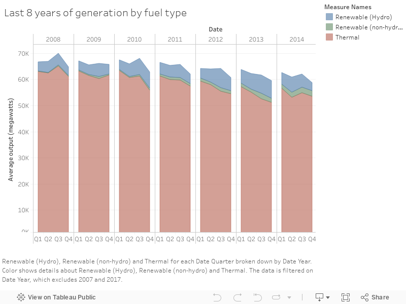
Chart number two - showing how total power output on the National Electricity Market has decreased, and how a sliver of wind and solar are adding to hydro in pushing down the output of thermal generation. Data courtesy of Nem Review.