Friday, 27 October 2017
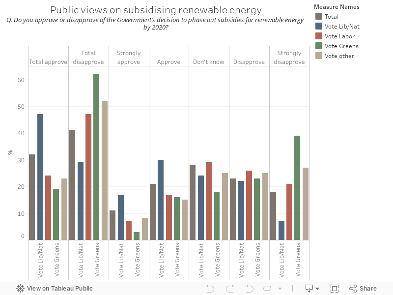
157 - Essential phase out subsidies polling
The chart below shows public views on whether subsidies should be used to incentivise renewables, via Essential
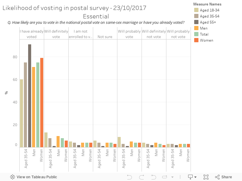
156 - Essential postal survey votes by age
The chart below shows intention to vote in Australia's postal survey on deciding rights for gay Australians, sorted by age and by gender and published on 23/10/2017 via Essential
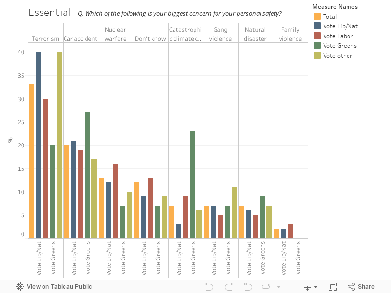
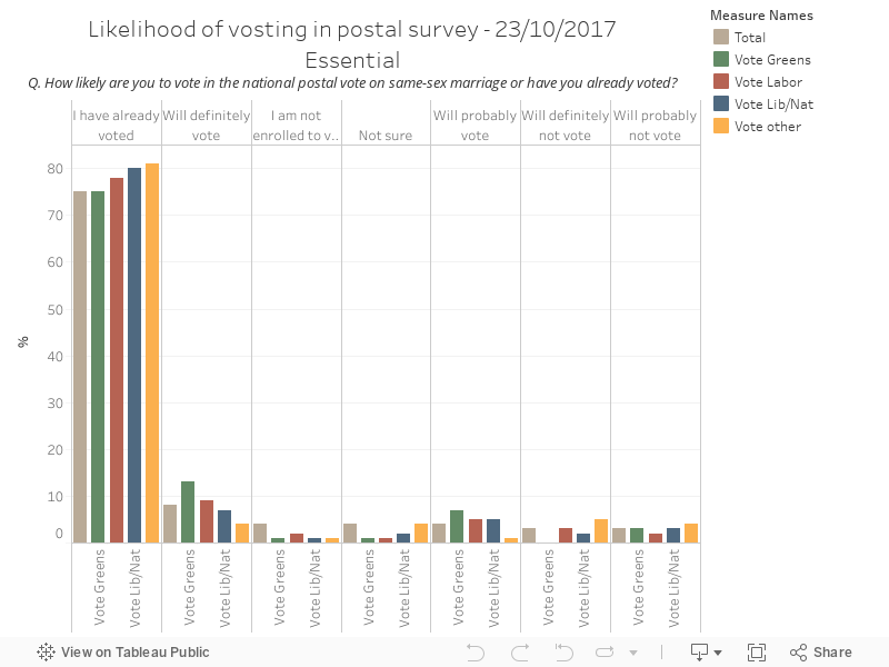
155 - Essential postal survey votes by party
The chart below shows intention to vote in Australia's postal survey on deciding rights for gay Australians, sorted by political party and published on 23/10/2017 via Essential
Monday, 23 October 2017
154 - Top 50 stations by weekday
This series is a big, huge, wonderful batch of Opal card data from two very limited time periods and completely anonymised using a range of techniques, from the NSW Open Data portal. You have to sign up to NSW Open Data to get copies, but it's worth it, it's quite interesting.
The chart below shows the top 50 stations by total taps for the full time period, by weekday
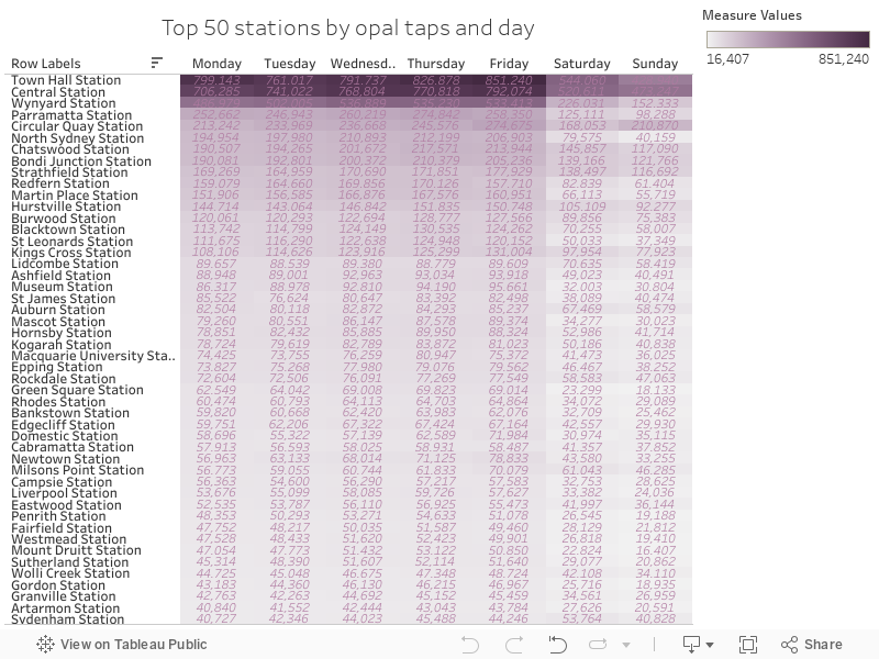
The chart below shows the top 50 stations by total taps for the full time period, by weekday
153 - Opal trips by postcode
This series is a big, huge, wonderful batch of Opal card data from two very limited time periods and completely anonymised using a range of techniques, from the NSW Open Data portal. You have to sign up to NSW Open Data to get copies, but it's worth it, it's quite interesting.
The chart below shows total trips by postcode, excluding 2000 (because it was huge)
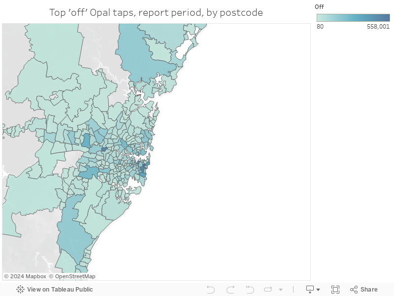
The chart below shows total trips by postcode, excluding 2000 (because it was huge)
152 - Opal tips by mode, day and hour
This series is a big, huge, wonderful batch of Opal card data from two very limited time periods and completely anonymised using a range of techniques, from the NSW Open Data portal. You have to sign up to NSW Open Data to get copies, but it's worth it, it's quite interesting.
The chart below shows total taps made by mode of transport and day, for all of the days available in the total data set
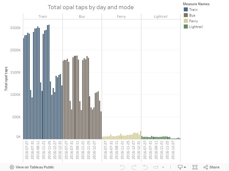
The chart below shows total taps made by mode of transport and day, for all of the days available in the total data set
151 - Opal ferry data by time and day
This series is a big, huge, wonderful batch of Opal card data from two very limited time periods and completely anonymised using a range of techniques, from the NSW Open Data portal. You have to sign up to NSW Open Data to get copies, but it's worth it, it's quite interesting.
This chart shows total taps by day and hour, for NSW' ferries
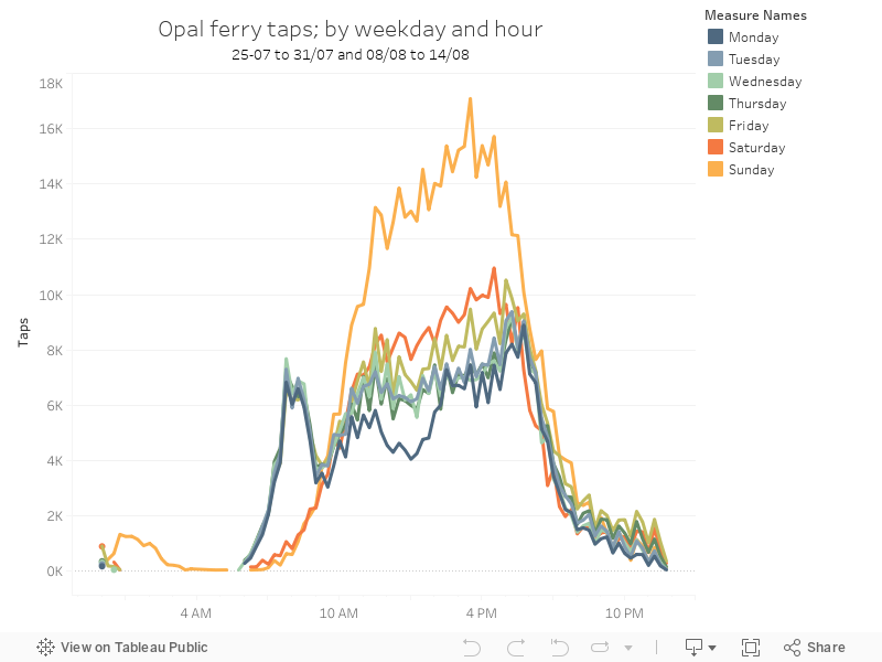
This chart shows total taps by day and hour, for NSW' ferries
150 - Opal train data by time and day
This series is a big, huge, wonderful batch of Opal card data from two very limited time periods and completely anonymised using a range of techniques, from the NSW Open Data portal. You have to sign up to NSW Open Data to get copies, but it's worth it, it's quite interesting.
This chart shows total train-specific taps by day, and by hour
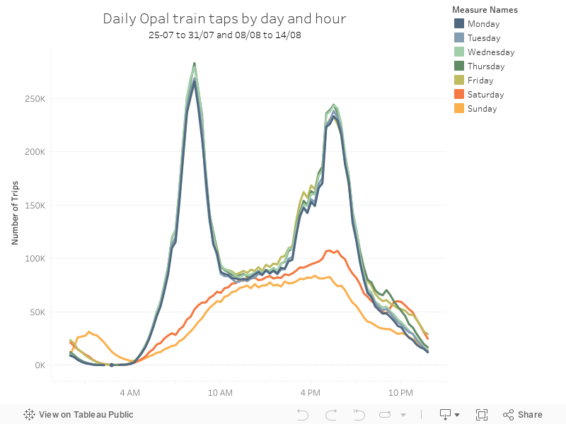
This chart shows total train-specific taps by day, and by hour
149 - Tap on vs tap off - Opal Train data
This series is a big, huge, wonderful batch of Opal card data from two very limited time periods and completely anonymised using a range of techniques, from the NSW Open Data portal. You have to sign up to NSW Open Data to get copies, but it's worth it, it's quite interesting.
The data below show taps on vs taps off, showing the start and end of journeys by hour, only for trains
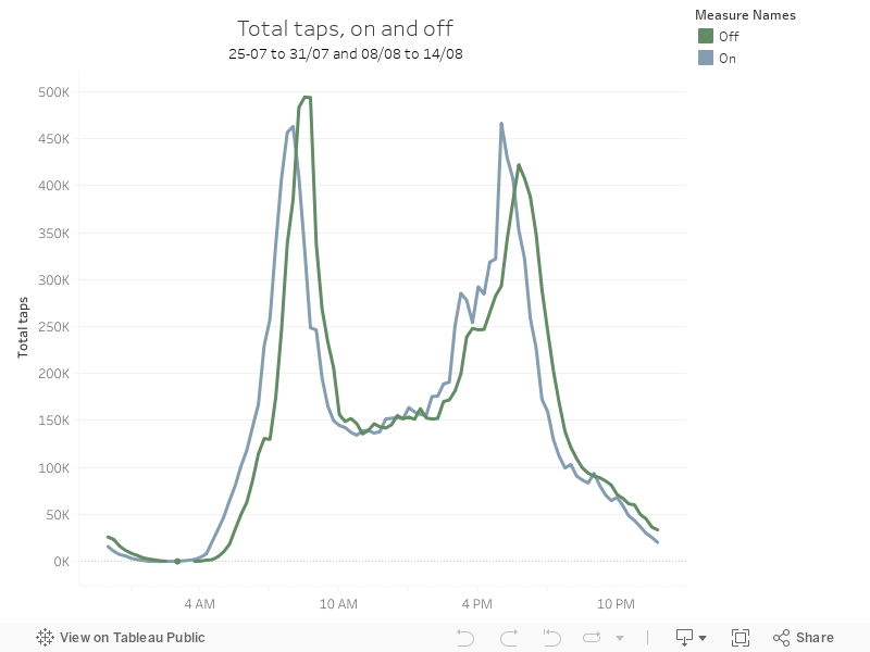
The data below show taps on vs taps off, showing the start and end of journeys by hour, only for trains
148 - Opal Data Daily - Batch 2 - Holiday/NYE
This series is a big, huge, wonderful batch of Opal card data from two very limited time periods and completely anonymised using a range of techniques, from the NSW Open Data portal. You have to sign up to NSW Open Data to get copies, but it's worth it, it's quite interesting.
This second period is 21/11/2016 to 27/11/2016 and 26/12/2016 to 01/01/2017, showing total taps in a holiday period
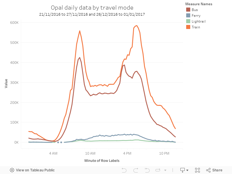
This second period is 21/11/2016 to 27/11/2016 and 26/12/2016 to 01/01/2017, showing total taps in a holiday period
147 - Opal data Daily - Batch 1 - Normal
This series is a big, huge, wonderful batch of Opal card data from two very limited time periods and completely anonymised using a range of techniques, from the NSW Open Data portal. You have to sign up to NSW Open Data to get copies, but it's worth it, it's quite interesting.
Time period one is 25-07 to 31/07 and 08/08 to 14/08, and the chart below shows total taps by hour of day and mode of transport.
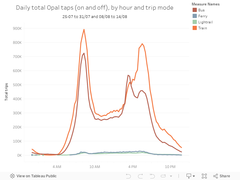
Time period one is 25-07 to 31/07 and 08/08 to 14/08, and the chart below shows total taps by hour of day and mode of transport.
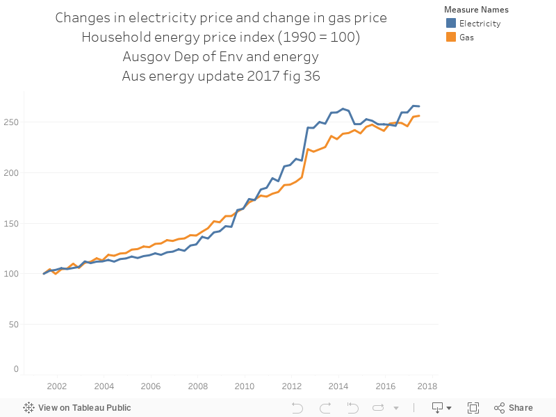
146 - Elec vs Gas prices
The chart below shows the clear relationship between rising electricity prices and rising gas prices, using data from environment.gov.au, here https://www.environment.gov.au/energy/publications/australian-energy-update-2017
145 - Average price by month and weekday
This series of data is a big, huge data set of petrol price that I got from Open Data Transport for NSW - it's an amazing site\ with *so* much great data in there. You have to sign up to get the data. The time period is August 2016 to June 2017.
The chart below shows average petrol price by month and weekday:
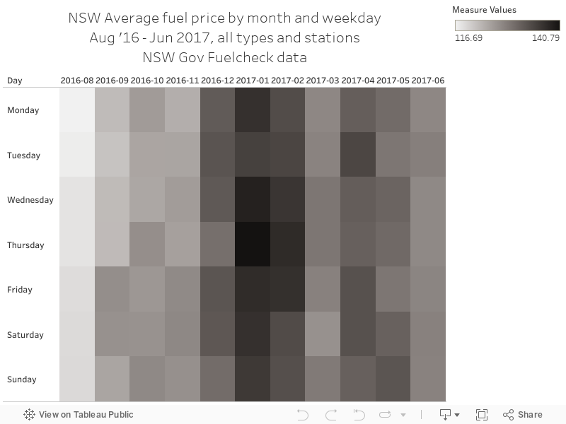
The chart below shows average petrol price by month and weekday:
144 - Avg price by brand and month
This series of data is a big, huge data set of petrol price that I got from Open Data Transport for NSW - it's an amazing site\ with *so* much great data in there. You have to sign up to get the data. The time period is August 2016 to June 2017.
The chart below shows the average price by the brand of petrol station and by month:
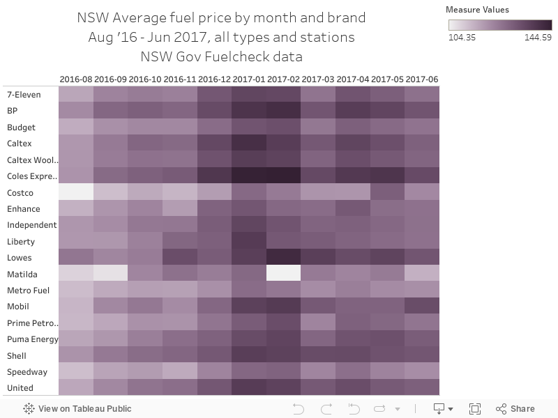
The chart below shows the average price by the brand of petrol station and by month:
143 - Avg price by weekday and time
This series of data is a big, huge data set of petrol price that I got from Open Data Transport for NSW - it's an amazing site\ with *so* much great data in there. You have to sign up to get the data. The time period is August 2016 to June 2017.
The chart below shows average price by weekday and time of day
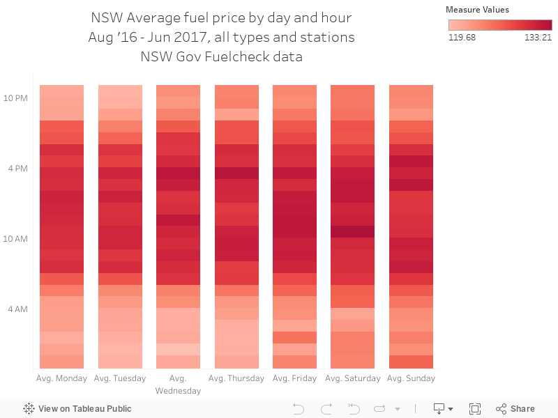
The chart below shows average price by weekday and time of day
142 - Fuel map - 2016 + 2017 by postcode and avg price
This series of data is a big, huge data set of petrol price that I got from Open Data Transport for NSW - it's an amazing site\ with *so* much great data in there. You have to sign up to get the data. The time period is August 2016 to June 2017.
Data below shows a map of average fuel price by postcode and by average price.
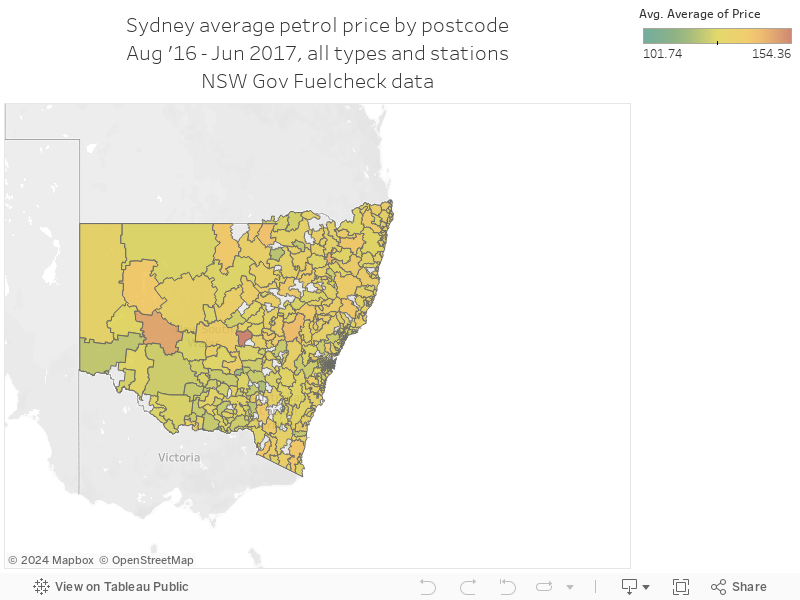
Data below shows a map of average fuel price by postcode and by average price.
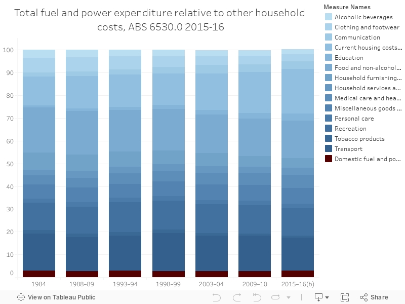
141 - Household power and fuel costs - 1984 - 2016 Proportion
The history of household spending on power and electricity in Australia, going back quite some time. Source - by proportion - which is interesting. Power and gas hasn't increased as much as I expected it would have.
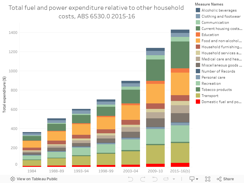
140 - Household power and fuel costs - 1984 - 2016
The history of household spending on power and electricity in Australia, going back quite some time. Source
Sunday, 10 September 2017
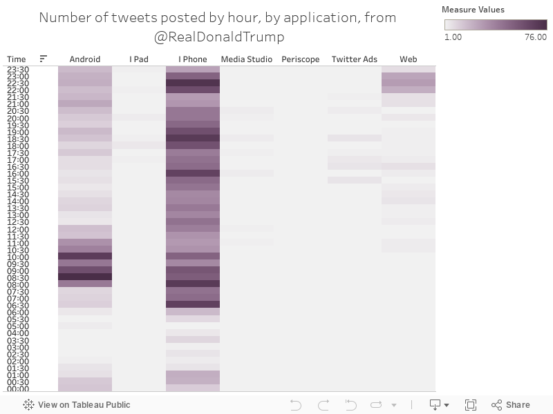
139 - Daily profile by app
Charts 131 to 139 are a series of tweets from a spreadsheet I created that logs tweets from US President Donald Trump, and appends them with some other stats to create analysis. Some things you should know:
- All the charts are in United States Eastern Standard Time
- Sentiment analysis is approximate, but interesting
- The election was on 09/11/2016
- Trump was sworn in on 20/01/2017
- For a long time, Trump was tweeting from his own Android phone - this seemed to completely stop around March 2017. Before that happened, we could draw some interesting insights from the app that the tweets came from
- Most of these charts show a full year, 03/08/2016 to 03/08/2017, unless shown or stated otherwise.
The chart below shows the number of tweets posted by half-hour chunks, sorted by app - with Android tweets coming earlier in the morning and iPhone tweets spread quite equally.
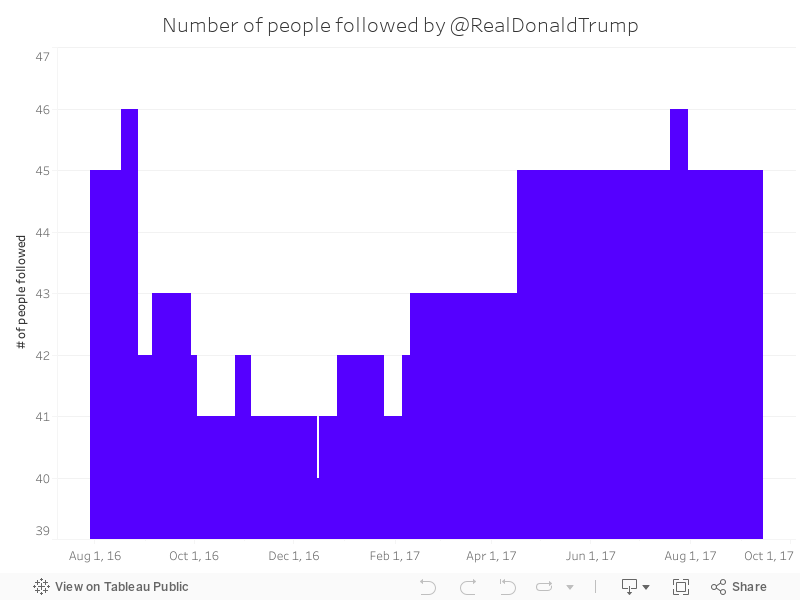
138 - Trumptweets - # of people being followed by RDT
Charts 131 to 139 are a series of tweets from a spreadsheet I created that logs tweets from US President Donald Trump, and appends them with some other stats to create analysis. Some things you should know:
- All the charts are in United States Eastern Standard Time
- Sentiment analysis is approximate, but interesting
- The election was on 09/11/2016
- Trump was sworn in on 20/01/2017
- For a long time, Trump was tweeting from his own Android phone - this seemed to completely stop around March 2017. Before that happened, we could draw some interesting insights from the app that the tweets came from
- Most of these charts show a full year, 03/08/2016 to 03/08/2017, unless shown or stated otherwise.
The chart below shows, at each point during the period, how many people the @RealDonaldTrump account was following:
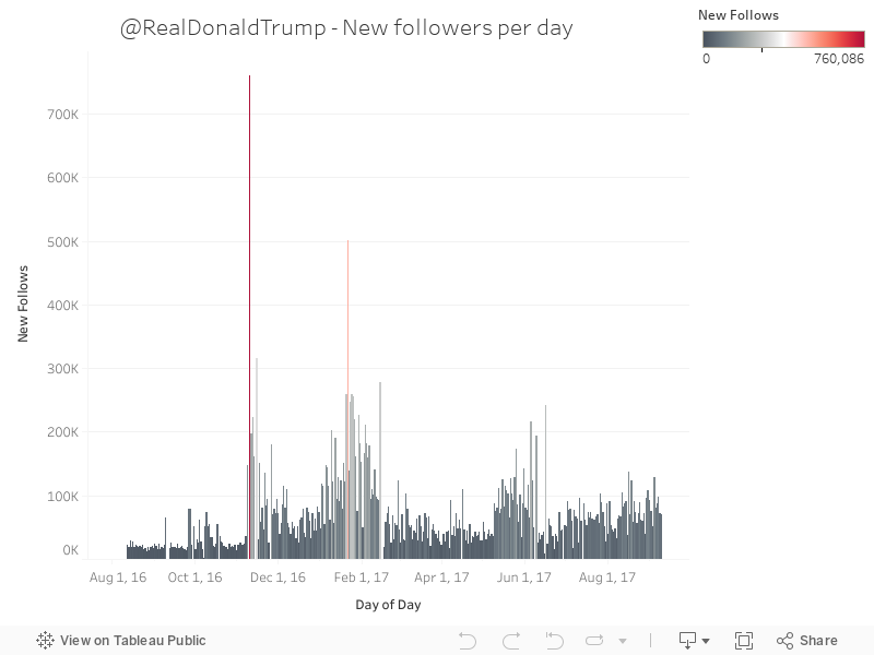
137 - New Trump followers per day
Charts 131 to 139 are a series of tweets from a spreadsheet I created that logs tweets from US President Donald Trump, and appends them with some other stats to create analysis. Some things you should know:
- All the charts are in United States Eastern Standard Time
- Sentiment analysis is approximate, but interesting
- The election was on 09/11/2016
- Trump was sworn in on 20/01/2017
- For a long time, Trump was tweeting from his own Android phone - this seemed to completely stop around March 2017. Before that happened, we could draw some interesting insights from the app that the tweets came from
- Most of these charts show a full year, 03/08/2016 to 03/08/2017, unless shown or stated otherwise.
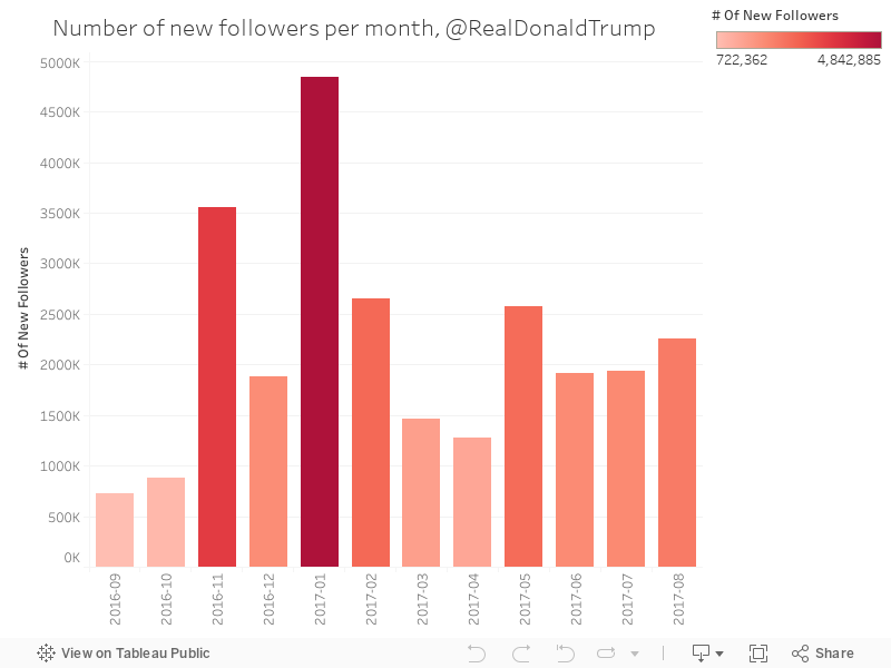
136 - New Trump followers per month
Charts 131 to 139 are a series of tweets from a spreadsheet I created that logs tweets from US President Donald Trump, and appends them with some other stats to create analysis. Some things you should know:
- All the charts are in United States Eastern Standard Time
- Sentiment analysis is approximate, but interesting
- The election was on 09/11/2016
- Trump was sworn in on 20/01/2017
- For a long time, Trump was tweeting from his own Android phone - this seemed to completely stop around March 2017. Before that happened, we could draw some interesting insights from the app that the tweets came from
- Most of these charts show a full year, 03/08/2016 to 03/08/2017, unless shown or stated otherwise.
The chart below shows the number of new followers per month.
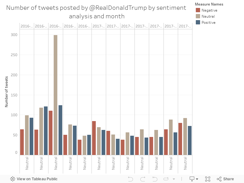
135 - Trump's tweets by sentiment and month
Charts 131 to 139 are a series of tweets from a spreadsheet I created that logs tweets from US President Donald Trump, and appends them with some other stats to create analysis. Some things you should know:
- All the charts are in United States Eastern Standard Time
- Sentiment analysis is approximate, but interesting
- The election was on 09/11/2016
- Trump was sworn in on 20/01/2017
- For a long time, Trump was tweeting from his own Android phone - this seemed to completely stop around March 2017. Before that happened, we could draw some interesting insights from the app that the tweets came from
- Most of these charts show a full year, 03/08/2016 to 03/08/2017, unless shown or stated otherwise.
This chart shows an interesting shift in sentiment from January this year through to July, shifting from more negative tweets to more neutral ones.
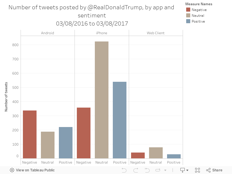
134 - Trump's tweet by sentiment and app
Charts 131 to 139 are a series of tweets from a spreadsheet I created that logs tweets from US President Donald Trump, and appends them with some other stats to create analysis. Some things you should know:
- All the charts are in United States Eastern Standard Time
- Sentiment analysis is approximate, but interesting
- The election was on 09/11/2016
- Trump was sworn in on 20/01/2017
- For a long time, Trump was tweeting from his own Android phone - this seemed to completely stop around March 2017. Before that happened, we could draw some interesting insights from the app that the tweets came from
- Most of these charts show a full year, 03/08/2016 to 03/08/2017, unless shown or stated otherwise.
The chart below shows an interesting effect - tweets from android were more negative than tweets from iphone
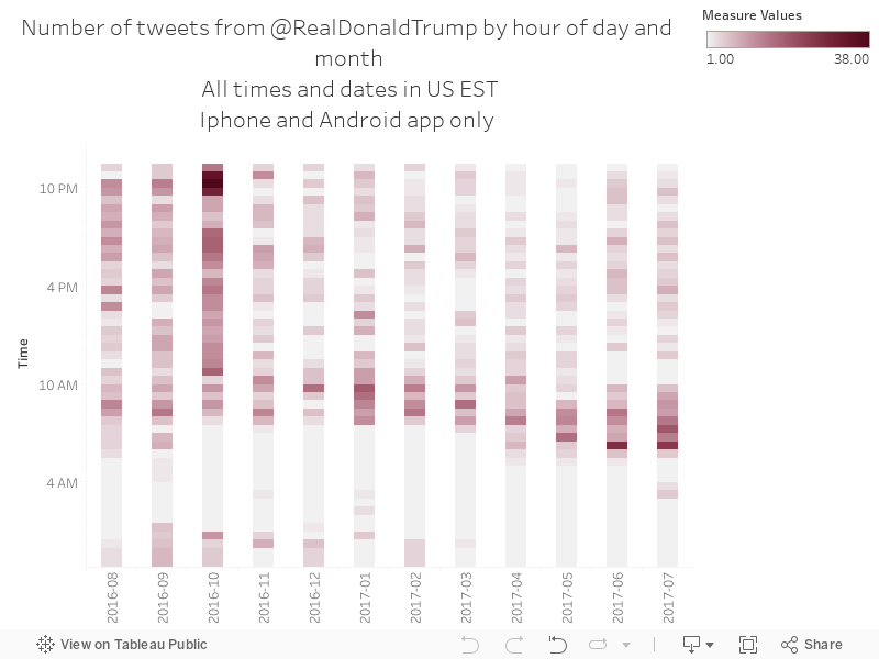
133 - Trumps tweets daily profile by month
Charts 131 to 139 are a series of tweets from a spreadsheet I created that logs tweets from US President Donald Trump, and appends them with some other stats to create analysis. Some things you should know:
- All the charts are in United States Eastern Standard Time
- Sentiment analysis is approximate, but interesting
- The election was on 09/11/2016
- Trump was sworn in on 20/01/2017
- For a long time, Trump was tweeting from his own Android phone - this seemed to completely stop around March 2017. Before that happened, we could draw some interesting insights from the app that the tweets came from
- Most of these charts show a full year, 03/08/2016 to 03/08/2017, unless shown or stated otherwise.
The chart below shows an interesting effect - over the past few months, morning tweets have been getting earlier.
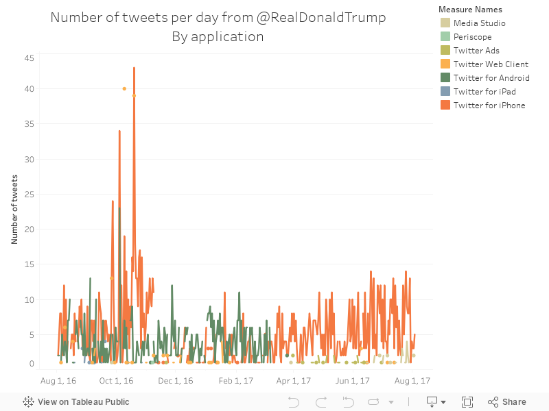
132 - Trumps tweets per day per app
Charts 131 to 139 are a series of tweets from a spreadsheet I created that logs tweets from US President Donald Trump, and appends them with some other stats to create analysis. Some things you should know:
- All the charts are in United States Eastern Standard Time
- Sentiment analysis is approximate, but interesting
- The election was on 09/11/2016
- Trump was sworn in on 20/01/2017
- For a long time, Trump was tweeting from his own Android phone - this seemed to completely stop around March 2017. Before that happened, we could draw some interesting insights from the app that the tweets came from
- Most of these charts show a full year, 03/08/2016 to 03/08/2017, unless shown or stated otherwise.
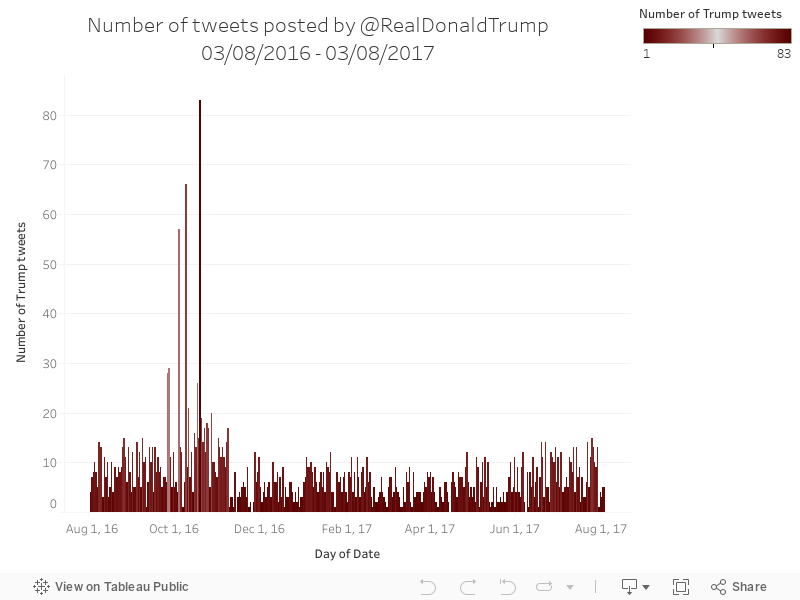
131 - Trump's Total tweets per day
Charts 131 to 139 are a series of tweets from a spreadsheet I created that logs tweets from US President Donald Trump, and appends them with some other stats to create analysis. Some things you should know:
- All the charts are in United States Eastern Standard Time
- Sentiment analysis is approximate, but interesting
- The election was on 09/11/2016
- Trump was sworn in on 20/01/2017
- For a long time, Trump was tweeting from his own Android phone - this seemed to completely stop around March 2017. Before that happened, we could draw some interesting insights from the app that the tweets came from
- Most of these charts show a full year, 03/08/2016 to 03/08/2017, unless shown or stated otherwise.
- All the charts are in United States Eastern Standard Time
- Sentiment analysis is approximate, but interesting
- The election was on 09/11/2016
- Trump was sworn in on 20/01/2017
- For a long time, Trump was tweeting from his own Android phone - this seemed to completely stop around March 2017. Before that happened, we could draw some interesting insights from the app that the tweets came from
- Most of these charts show a full year, 03/08/2016 to 03/08/2017, unless shown or stated otherwise.
Saturday, 2 September 2017
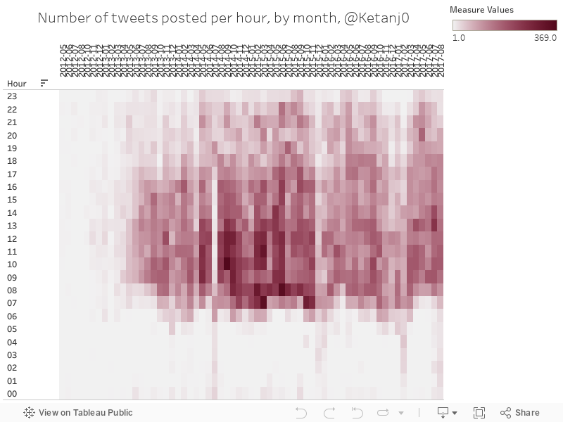
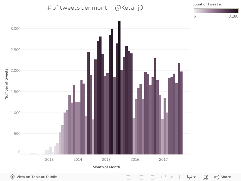
130 - My diurnal tweet patterns, historical
The number of tweets I've posted in each hour, split out by month.
128 - Avg battery temperature by day
I measured battery statistics on my Android Nexus 6P for a few months, using 3C Battery monitor widget.
Average battery temp by day - note a visit to a northern hemisphere country (it was summer) in July, and the resultant increase in battery temp in my phone. Temps seem to match ambient temp pretty closely.
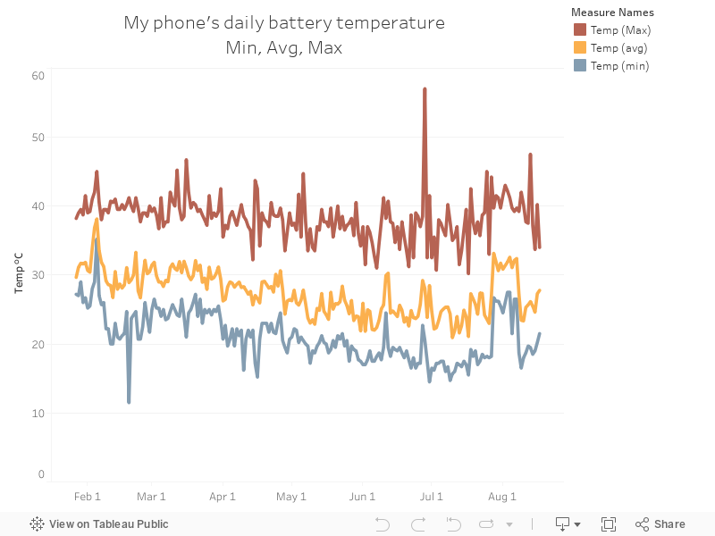
Average battery temp by day - note a visit to a northern hemisphere country (it was summer) in July, and the resultant increase in battery temp in my phone. Temps seem to match ambient temp pretty closely.
127 - Avg percent by month and hour
I measured battery statistics on my Android Nexus 6P for a few months, using 3C Battery monitor widget.
The chart below shows my average hourly battery percentage state, split out by month this year (I seem to be getting more paranoid about battery charge as the year goes on.....working from home for half of June and all of July is the cause of this, really)
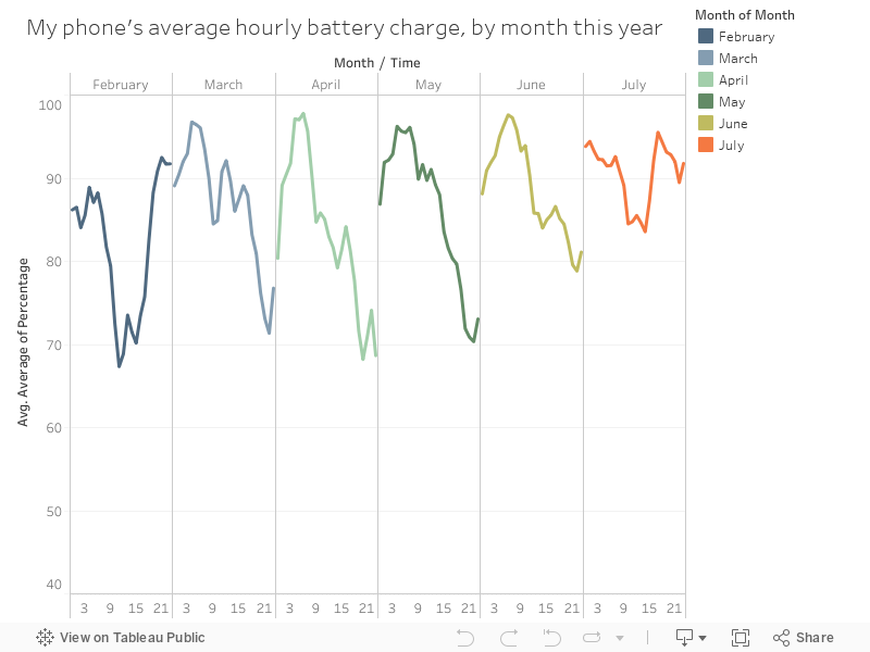
The chart below shows my average hourly battery percentage state, split out by month this year (I seem to be getting more paranoid about battery charge as the year goes on.....working from home for half of June and all of July is the cause of this, really)
126 - Average battery percentage, daily (Jan to August)
I measured battery statistics on my Android Nexus 6P for a few months, using 3C Battery monitor widget.
The chart below shows the average percentage battery charge state by hour, from Jan to Aug.
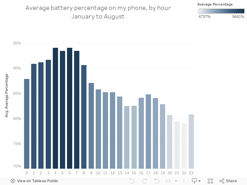
The chart below shows the average percentage battery charge state by hour, from Jan to Aug.
125 - Battery drain - daily average (Jan to August)
I measured battery statistics on my Android Nexus 6P for a few months, using 3C Battery monitor widget.
The chart below shows the average drain or charge on my battery my by hour, from January to August, by hour of day.
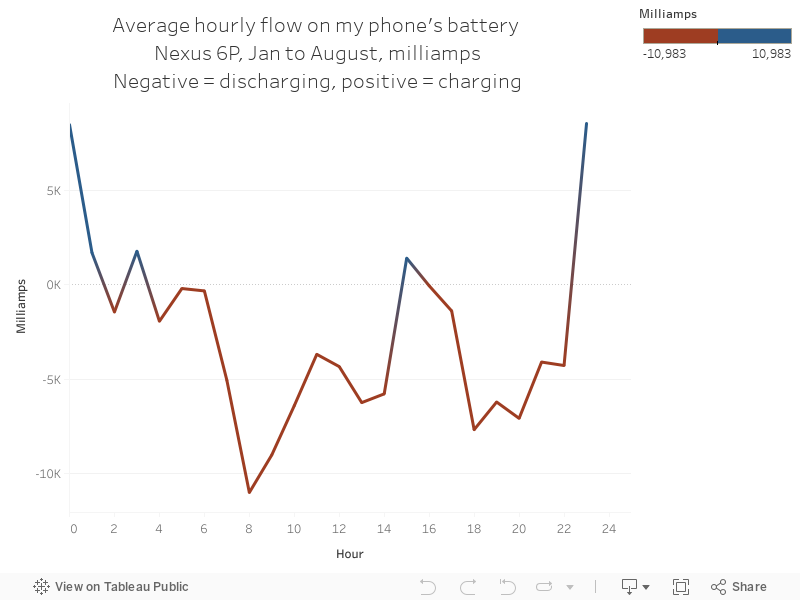
The chart below shows the average drain or charge on my battery my by hour, from January to August, by hour of day.
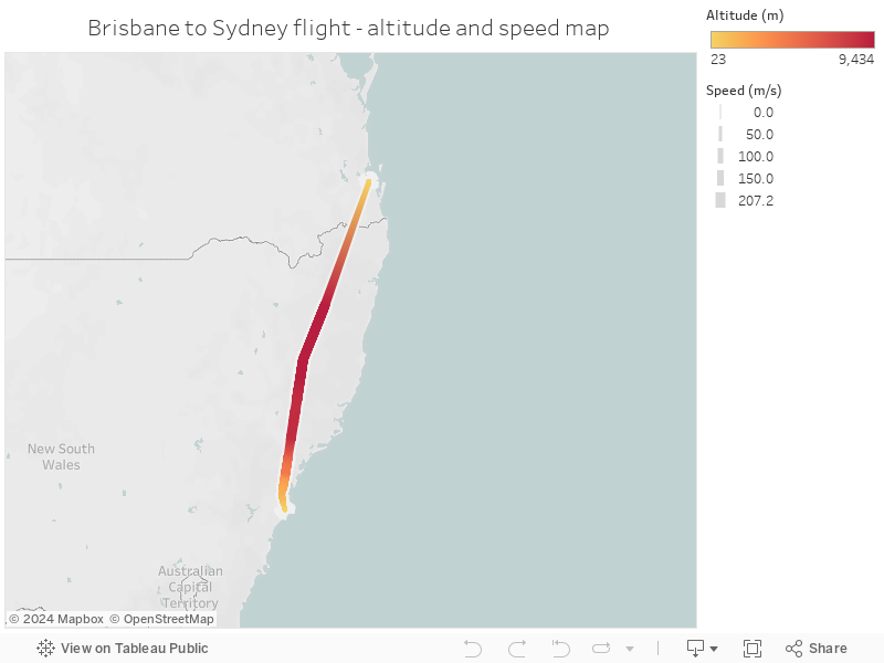
124 - Brisbane to Sydney flight speed map
A map showing a flight from Brisbane to Sydney, with the colour indicating altitude
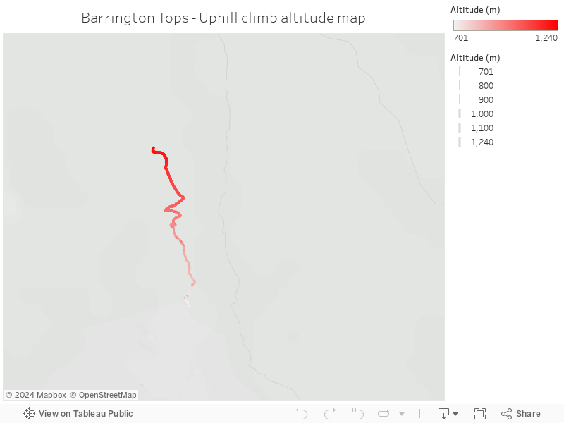
123 - Uphill climb - Barrington Tops
A map of a walk up a giant hill in Barrington Tops, NSW, showing altitude as the colour
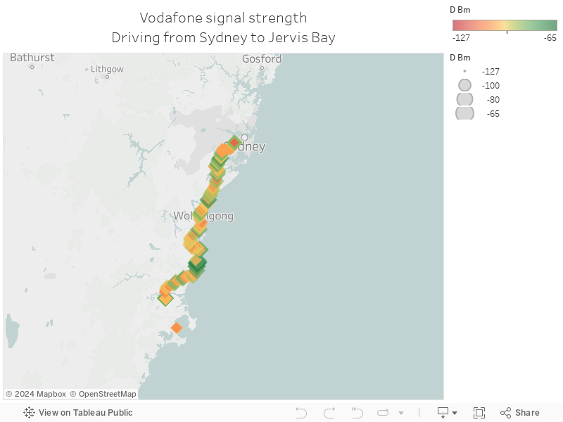
122 - Drive to Vincentia - mobile signal strength map
A map of a drive to Vincentia (with the start and end chopped off), showing mobile phone signal strength. I'm on Vodafone.
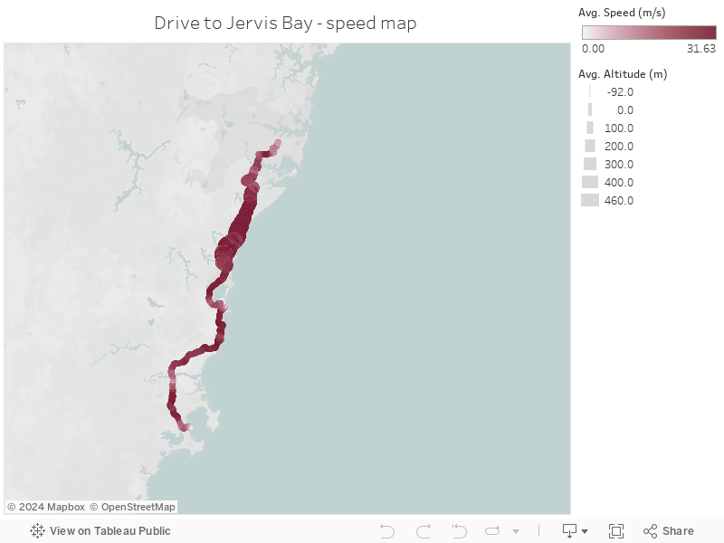
121 - Drive to Vincentia - Speed map
A map of a drive to Vincentia, showing average speed, with the start and end of the journey lopped off.
Wednesday, 23 August 2017
120 - 2017 Thermal efficiency by technology
Charts 116 through to 120 are a series from the Australian Energy Market Operator's South Australian Fuel and Technology Report, 2017, which can be accessed here.
The chart below shows the thermal efficiency of different technologies (sent out high heating value, HHV), which is basically how efficient the machine is at converting fuel to output.
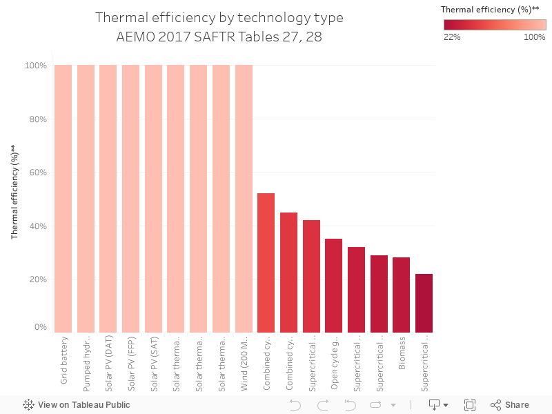
The chart below shows the thermal efficiency of different technologies (sent out high heating value, HHV), which is basically how efficient the machine is at converting fuel to output.
119 - Tech min LCoE, 2015 vs 2017
Charts 116 through to 120 are a series from the Australian Energy Market Operator's South Australian Fuel and Technology Report, 2017, which can be accessed here.
The chart below shows the levelised cost of energy (LCoE) by technology, comparing 2015 to 2017. Grid battery storage is up the top, but it's also seen the biggest drop in cost in two years out of all technologies.
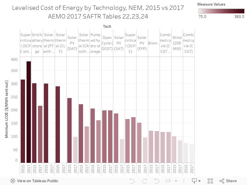
The chart below shows the levelised cost of energy (LCoE) by technology, comparing 2015 to 2017. Grid battery storage is up the top, but it's also seen the biggest drop in cost in two years out of all technologies.
118 - Tech emissions, 2015 vs 2017
Charts 116 through to 120 are a series from the Australian Energy Market Operator's South Australian Fuel and Technology Report, 2017, which can be accessed here.
Today's chart shows emissions intensity for every unit of ouput by technology, with super-critical coal at the top of the the list.
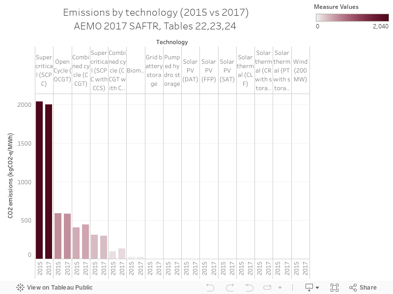
Today's chart shows emissions intensity for every unit of ouput by technology, with super-critical coal at the top of the the list.
117 - Installed capacity by physical attributes, NEM as at June2016
Charts 116 through to 120 are a series from the Australian Energy Market Operator's South Australian Fuel and Technology Report, 2017, which can be accessed here.
The chart below shows the spread of synchronous and non-synchronous generation across NEM regions, with SA having the highest proportion of non-synchronous generation.
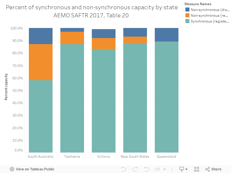
The chart below shows the spread of synchronous and non-synchronous generation across NEM regions, with SA having the highest proportion of non-synchronous generation.
116 - SA Coal resources map
Charts 116 through to 120 are a series from the Australian Energy Market Operator's South Australian Fuel and Technology Report, 2017, which can be accessed here.
The chart below shows South Australia's coal reserves, Table 9 in the report.
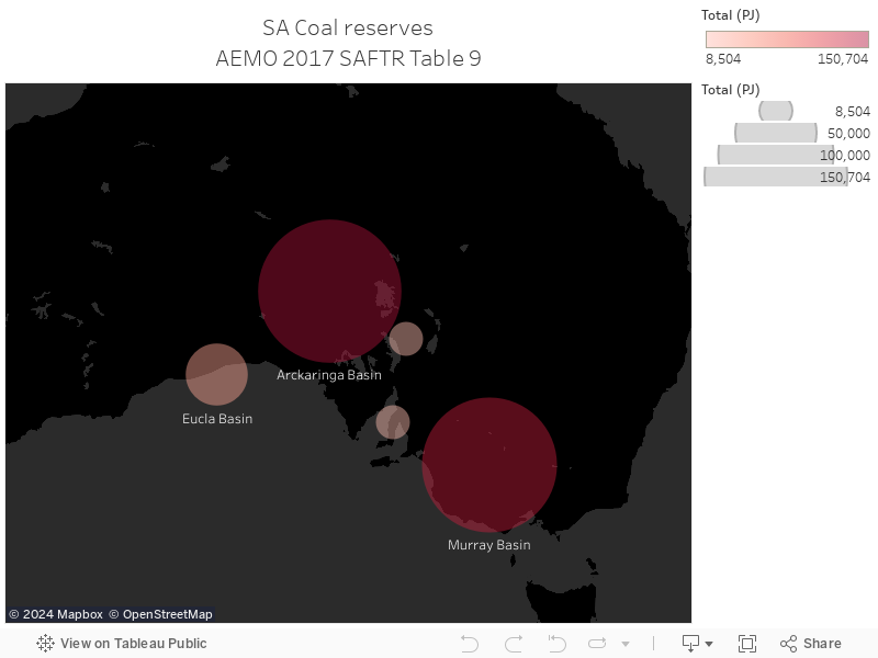
The chart below shows South Australia's coal reserves, Table 9 in the report.
115 - Mojave monthly capacity factor
Charts 106 through to 115 will be a series based on data from the United States Energy Information administration, with 108 to 115 focusing on solar thermal power stations in the US (South Australia just had an announcement about a big new solar thermal power station).
The Mojave solar project is another US solar thermal power station - the data below show capacity factor by month
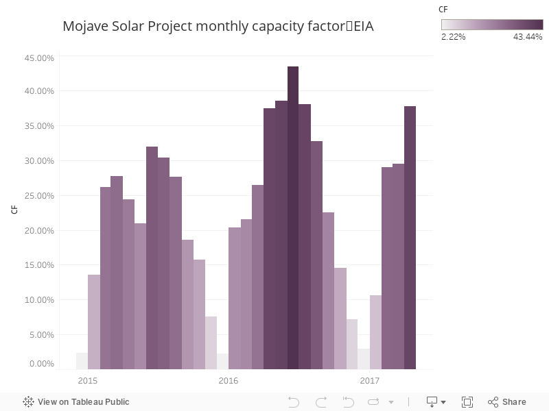
The Mojave solar project is another US solar thermal power station - the data below show capacity factor by month
114 - Mojave monthly output
Charts 106 through to 115 will be a series based on data from the United States Energy Information administration, with 108 to 115 focusing on solar thermal power stations in the US (South Australia just had an announcement about a big new solar thermal power station).
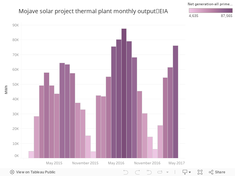
The Mojave solar project is another US solar thermal power station - the data below show output by month
112 - Solana Monthly Output
Charts 106 through to 115 will be a series based on data from the United States Energy Information administration, with 108 to 115 focusing on solar thermal power stations in the US (South Australia just had an announcement about a big new solar thermal power station).
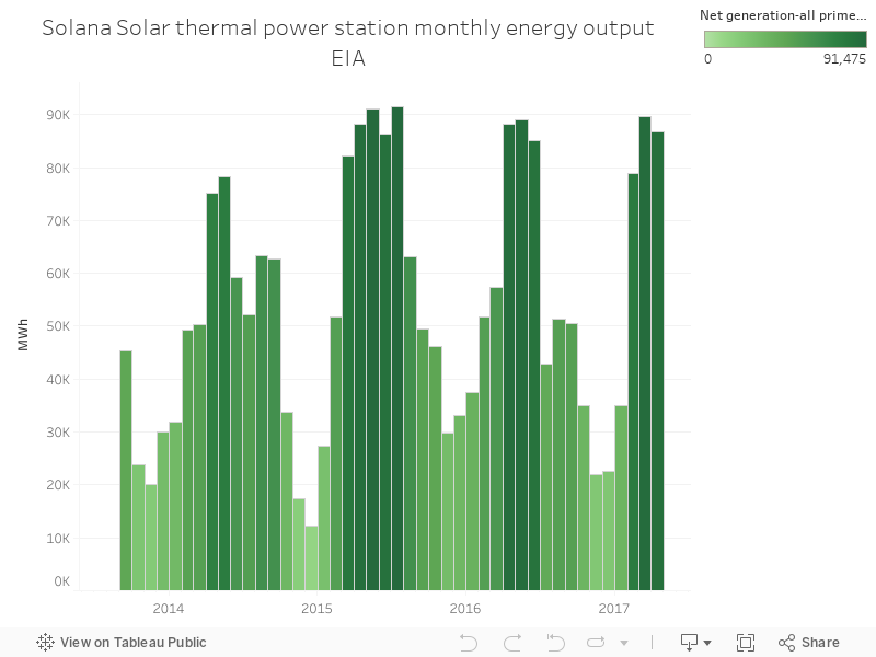
Solana solar thermal power station in the US uses a parabolic trough - mirrors pointed at a pipe - instead of concentrating sunlight using mirrors on a single receiver. The chart below shows monthly output for the power station going back to the start of operation.
Subscribe to:
Posts (Atom)