Showing posts with label electricity. Show all posts
Showing posts with label electricity. Show all posts
Monday, 23 October 2017
146 - Elec vs Gas prices
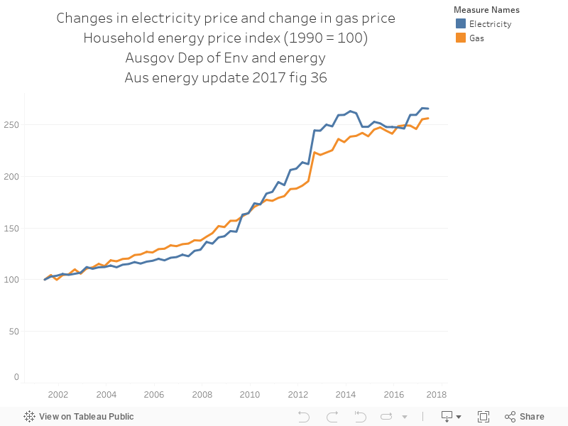
The chart below shows the clear relationship between rising electricity prices and rising gas prices, using data from environment.gov.au, here https://www.environment.gov.au/energy/publications/australian-energy-update-2017

Thursday, 20 July 2017
086 - NEM generation by fuel type
Some recent news - the Australian Government Department of Energy recently released the 'National Greenhouse Gas Inventory' - a big, all-encompassing update of exactly how much Australia is emitting into the Earth's atmosphere through the operation of our economy. There'a whole stack of data in the December 2016 update.
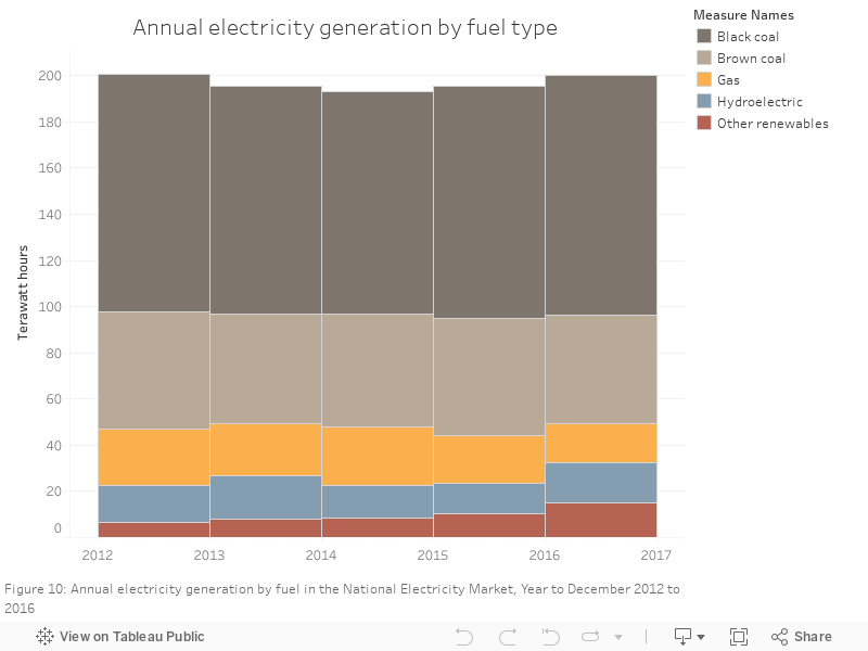
The chart below shows changes in electricity generation in the national electricity market. Though coal is going up, variable renewables and hydro are catching up with gas and coal. Compare 2012 to 2016 - that's a fair bit of change for four years, though there's still a long way to go.
The chart below shows changes in electricity generation in the national electricity market. Though coal is going up, variable renewables and hydro are catching up with gas and coal. Compare 2012 to 2016 - that's a fair bit of change for four years, though there's still a long way to go.
95 - Total bill - actuals vs forecast
As part of a recent blog post, I gathered up a bunch of data from the Australian Energy Markets Commission's analysis of Australian electricity bills. These charts are an expansion of that analysis.
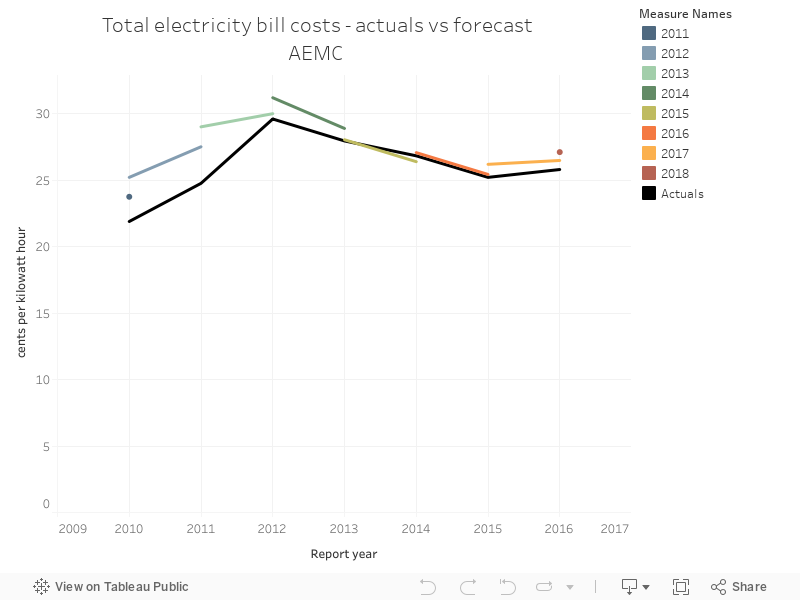
The chart below shows what the forecasted value for the total bill cost, in cents per kilowatt hour was in the two years leading up to a year, alongside what the actual value for that year was.
The chart below shows what the forecasted value for the total bill cost, in cents per kilowatt hour was in the two years leading up to a year, alongside what the actual value for that year was.
94 - Network costs actuals vs forecast
As part of a recent blog post, I gathered up a bunch of data from the Australian Energy Markets Commission's analysis of Australian electricity bills. These charts are an expansion of that analysis.
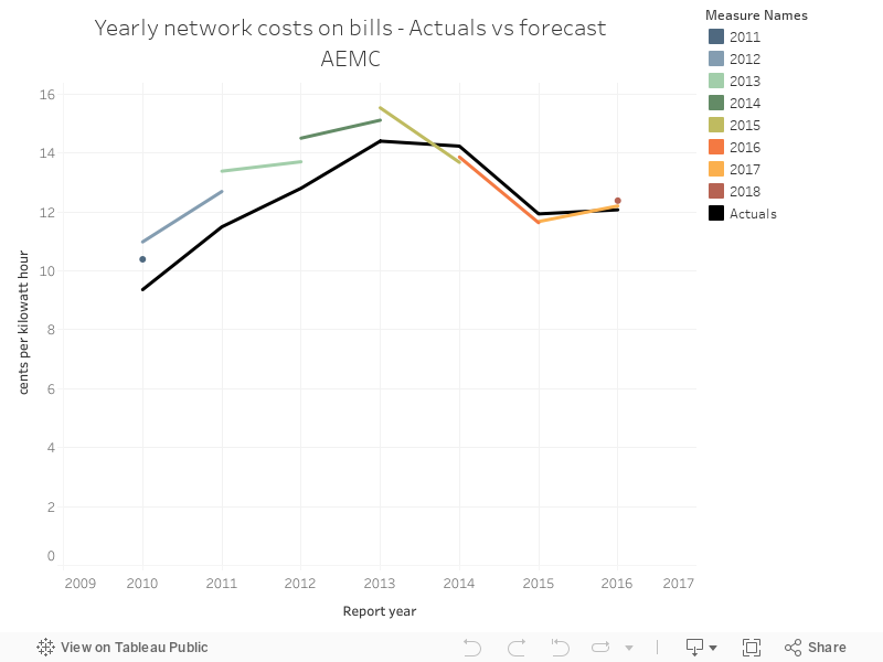
The chart below shows what the forecasted value for the Network component was in the two years leading up to a year, alongside what the actual value for that year was.
The chart below shows what the forecasted value for the Network component was in the two years leading up to a year, alongside what the actual value for that year was.
93 - LRET Actuals vs Forecast
As part of a recent blog post, I gathered up a bunch of data from the Australian Energy Markets Commission's analysis of Australian electricity bills. These charts are an expansion of that analysis.
The chart below shows what the forecasted value for the Large-scale renewable energy target component was in the two years leading up to a year, alongside what the actual value for that year was.
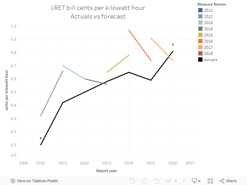
The chart below shows what the forecasted value for the Large-scale renewable energy target component was in the two years leading up to a year, alongside what the actual value for that year was.
92 - AEMC bill breakdown by total cents per kwh
As part of a recent blog post, I gathered up a bunch of data from the Australian Energy Markets Commission's analysis of Australian electricity bills. These charts are an expansion of that analysis.
The chart below shows the breakdown of electricity bills by year, by the total cents per kilowatt hour for each component.
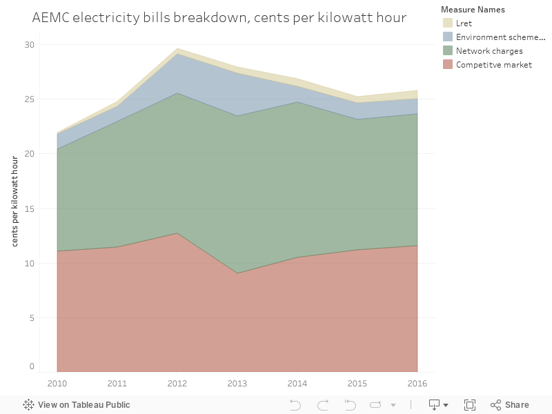
The chart below shows the breakdown of electricity bills by year, by the total cents per kilowatt hour for each component.
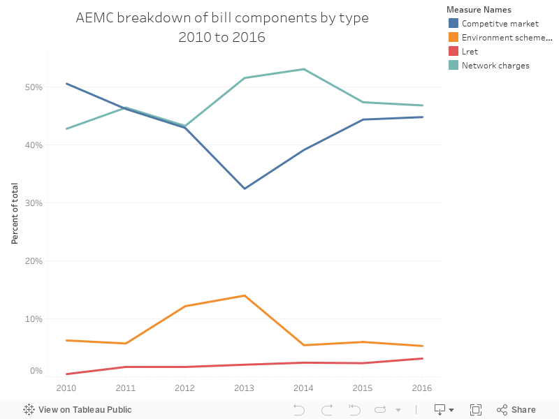
91 - AEMC bill breakdown by percent of total
089 - NEM generation vs elec emissions
Some recent news - the Australian Government Department of Energy recently released the 'National Greenhouse Gas Inventory' - a big, all-encompassing update of exactly how much Australia is emitting into the Earth's atmosphere through the operation of our economy. There'a whole stack of data in the December 2016 update.
The chart below shows the generation mix vs the total emissions for electricity - which have increased as coal's share has increased, over the past few years.
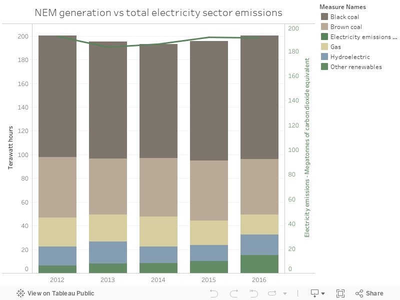
The chart below shows the generation mix vs the total emissions for electricity - which have increased as coal's share has increased, over the past few years.
088 - Non-hydro renewables are the only growing NEM tech
Some recent news - the Australian Government Department of Energy recently released the 'National Greenhouse Gas Inventory' - a big, all-encompassing update of exactly how much Australia is emitting into the Earth's atmosphere through the operation of our economy. There'a whole stack of data in the December 2016 update.
The chart below shows calculated change in output from the previous year, in total terawatt hours, for the NEM, by technology.

The chart below shows calculated change in output from the previous year, in total terawatt hours, for the NEM, by technology.
Wednesday, 19 July 2017
085 - NEM demand history
Some recent news - the Australian Government Department of Energy recently released the 'National Greenhouse Gas Inventory' - a big, all-encompassing update of exactly how much Australia is emitting into the Earth's atmosphere through the operation of our economy. There'a whole stack of data in the December 2016 update.
This chart answers the question - is demand going up or down? Of course, the answer is 'sort of both' - it's been relatively steady since 2015.
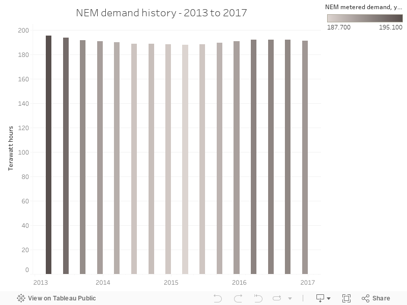
This chart answers the question - is demand going up or down? Of course, the answer is 'sort of both' - it's been relatively steady since 2015.
Thursday, 13 July 2017
081 - Wholesale price history, NEM
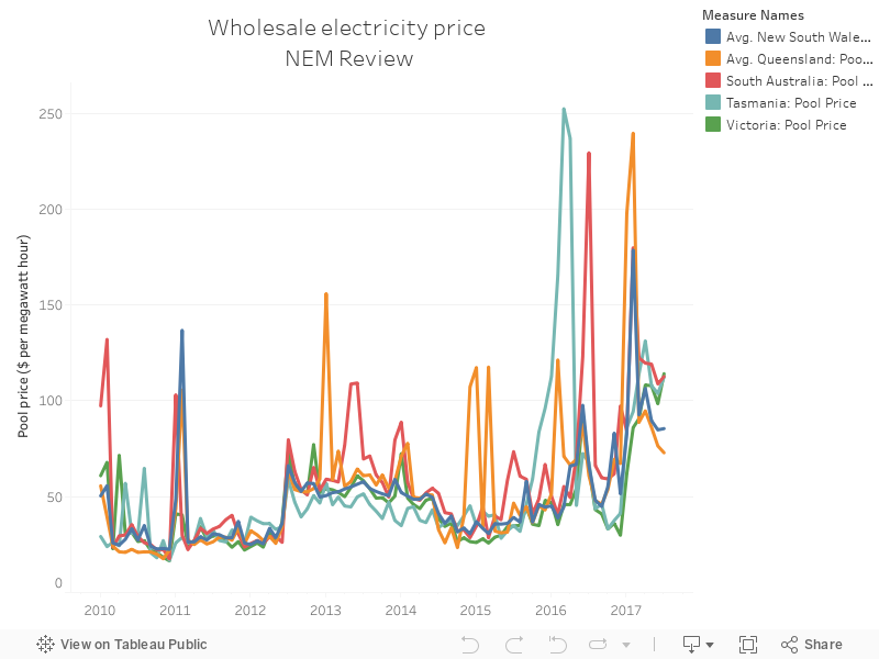
A simple monthly average by state, showing wholesale electricity price. The trends are clear, and there's not a huge amount of variation between the states.
Subscribe to:
Posts (Atom)