Showing posts with label Capacity. Show all posts

Wednesday, 23 August 2017

117 - Installed capacity by physical attributes, NEM as at June2016

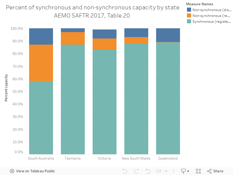
Charts 116 through to 120 are a series from the Australian Energy Market Operator's South Australian Fuel and Technology Report, 2017, which can be accessed here.

The chart below shows the spread of synchronous and non-synchronous generation across NEM regions, with SA having the highest proportion of non-synchronous generation.

Thursday, 20 July 2017

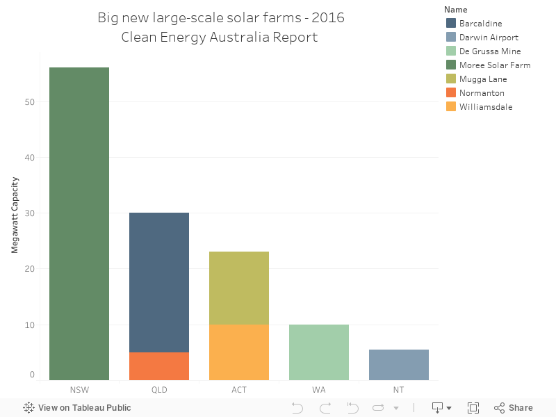
100 - New large-scale solar plants 2016

The Clean Energy Council's 2016 renewable energy report is a great summary of some vital statistics on Australian renewable energy from a variety of states.

The chart below shows a stack of new large scale solar farms in Australia 


Wednesday, 12 July 2017

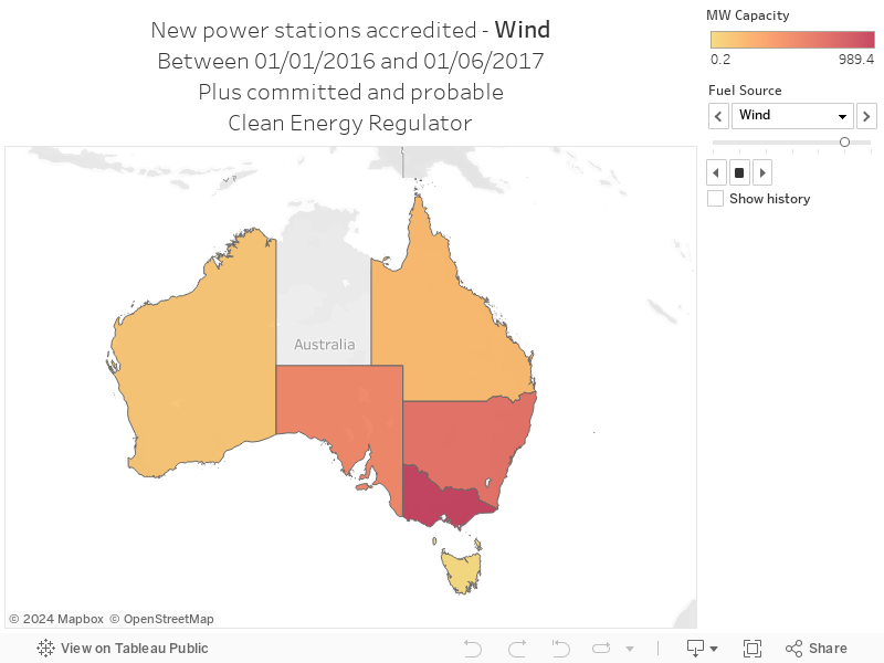
080 - New renewable power stations map

An interesting data set from the Clean Energy Regulator showing the new power stations that were accredited in 2016 and the first half of 2017, along with new power stations that are set to be built, shown on a map. Enjoy!


Tuesday, 11 July 2017

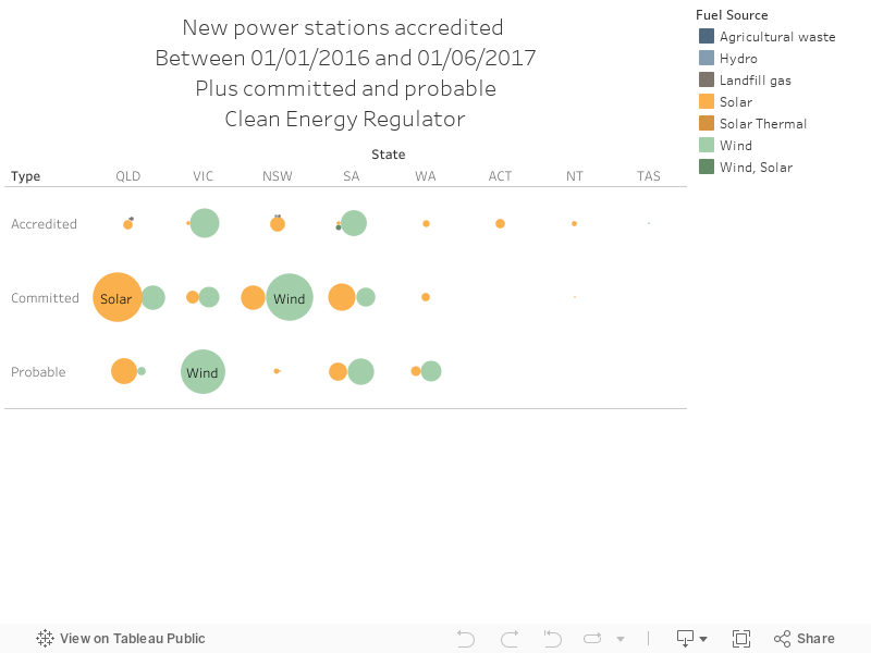
079 - New renewable energy power stations in Australia

An interesting data set from the Clean Energy Regulator showing the new power stations that were accredited in 2016 and the first half of 2017, along with new power stations that are set to be built, shown by state and technology type. Enjoy!


Monday, 10 July 2017

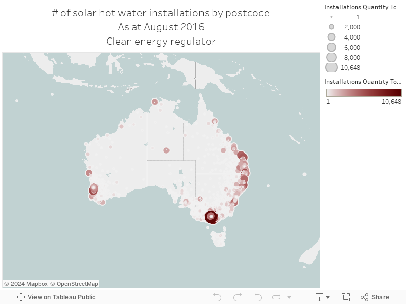
078 - Solar hot water installations map

Also from the Clean Energy Regulator - a map of the total number of installations of solar hot water systems, as part of the small scale renewable energy scheme, by postcode. Enjoy!


Sunday, 9 July 2017

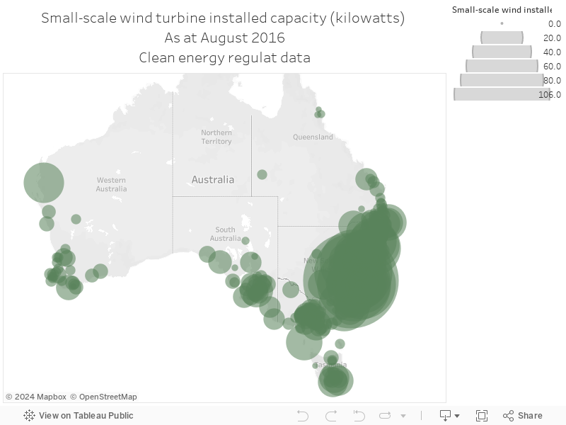
077 - Small wind turbine installations in Australia map

The Clean Energy Regulator makes installation data for small-scale wind turbines available as part of their incentive scheme - the map shows installed capacity by postcode.


Tuesday, 30 May 2017

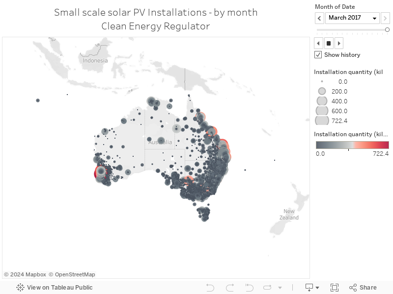
050 - Australian rooftop solar installation data - Monthly

The Clean Energy Regulator makes detailed postcode-level data on solar PV installations publicly available, and it's updated regularly. The map below shows total installations per month - you can use the month card on the right hand side to navigate:


Monday, 29 May 2017

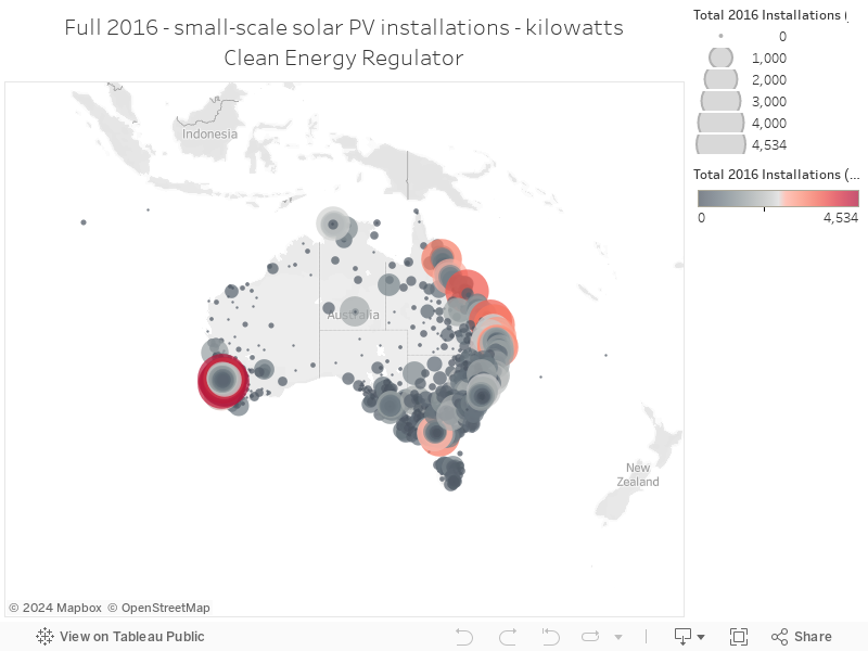
049 - Australian rooftop solar installation data - 2016

The Clean Energy Regulator makes detailed postcode-level data on solar PV installations publicly available, and it's updated regularly. The map below shows total installations for the full year of 2016 in total kilowatts:


Sunday, 28 May 2017

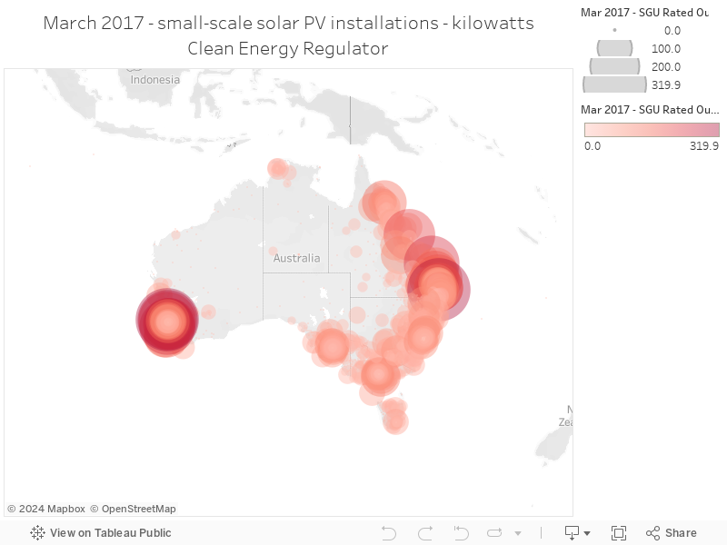
048 - Australian rooftop solar installation data - March 2017

The Clean Energy Regulator makes detailed postcode-level data on solar PV installations publicly available, and it's updated regularly. The map below shows total installations for the month of March 2017:


Wednesday, 10 May 2017

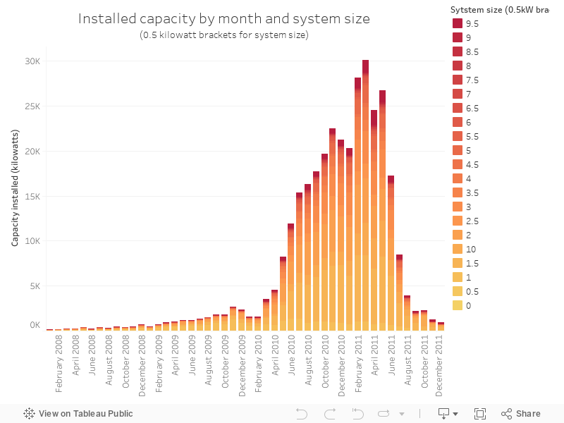
036 - Changes in installation size over the Solar Bonus Scheme

The NSW solar bonus scheme was launched in January 2010, "to encourage the uptake of renewable energy, handed homeowners 60¢ or 20¢ "feed-in" tariffs per kilowatt hour, for the solar energy they put back into the grid".

The NSW government makes data available on their website detailing installations - the chart below shows the amount of capacity installed each month, broken up by the size of the installation. Bigger installations are darker red; smaller ones are lighter.

Source.

Tuesday, 9 May 2017

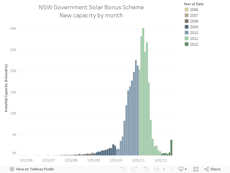
035 - The rapid uptick in solar installations under NSW's solar bonus scheme

The NSW solar bonus scheme was launched in January 2010, "to encourage the uptake of renewable energy, handed homeowners 60¢ or 20¢ "feed-in" tariffs per kilowatt hour, for the solar energy they put back into the grid".

The NSW government makes data available on their website detailing installations - the chart below shows the total capacity installed for each month in the data set.

Source.


Thursday, 4 May 2017

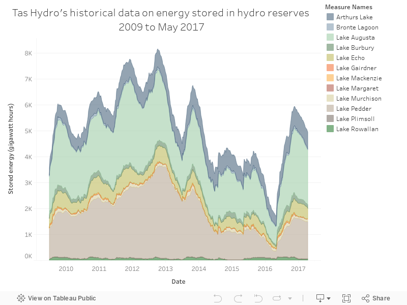
032 - Tasmania's history as a giant battery for Australia

In light of a recent announcement regarding Tasmania and hydro storage, here's a chart from Hydro Tasmania's website, showing the quantity of energy stored by the reserves in Tasmania, with a pointed drop late last year - the Tasmanian energy crisis, which coincided with the failure of an interconnector between Tasmania and the mainland.


Wednesday, 26 April 2017

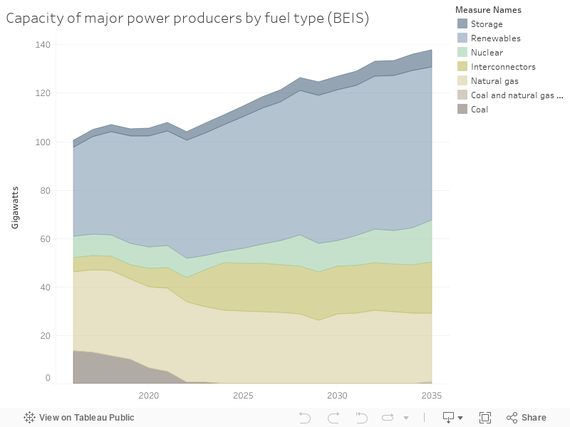
026 - The UK's fascinating forecasts of capacity growth

The UK government's Department for Business, Energy & Industrial Strategy (BEIS) published a bunch of forecasts recently - the chart below shows the varied capacities of technologies they forecast will dominate their electricity system. Source.


Monday, 10 April 2017

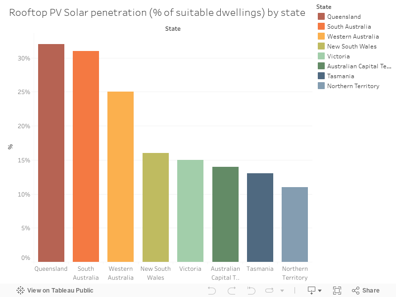
017 - Queensland dominates rooftop PV penetration

As part of the ABS' recent data release on employment, an update of recent installation data on rooftop-PV was included, shown below. Queensland dominates. It's very sunny there.

Source.