Today's chart shows emissions intensity for every unit of ouput by technology, with super-critical coal at the top of the the list.
Showing posts with label Emissions. Show all posts
Wednesday, 23 August 2017
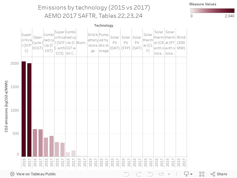
118 - Tech emissions, 2015 vs 2017
Charts 116 through to 120 are a series from the Australian Energy Market Operator's South Australian Fuel and Technology Report, 2017, which can be accessed here.
Today's chart shows emissions intensity for every unit of ouput by technology, with super-critical coal at the top of the the list.
Thursday, 20 July 2017
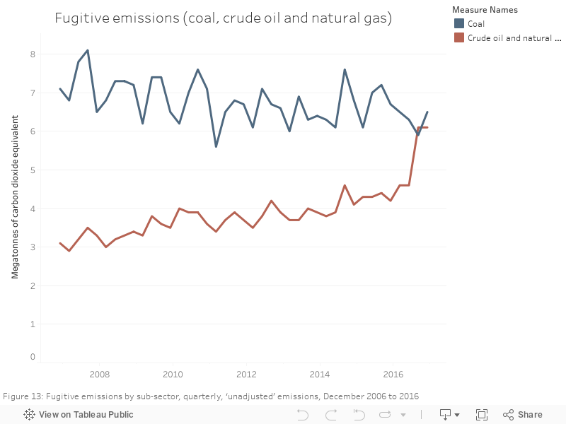
087 - Fugitive emissions
Some recent news - the Australian Government Department of Energy recently released the 'National Greenhouse Gas Inventory' - a big, all-encompassing update of exactly how much Australia is emitting into the Earth's atmosphere through the operation of our economy. There'a whole stack of data in the December 2016 update.
The chart below shows fugitive emissions for coal and gas
089 - NEM generation vs elec emissions
Some recent news - the Australian Government Department of Energy recently released the 'National Greenhouse Gas Inventory' - a big, all-encompassing update of exactly how much Australia is emitting into the Earth's atmosphere through the operation of our economy. There'a whole stack of data in the December 2016 update.
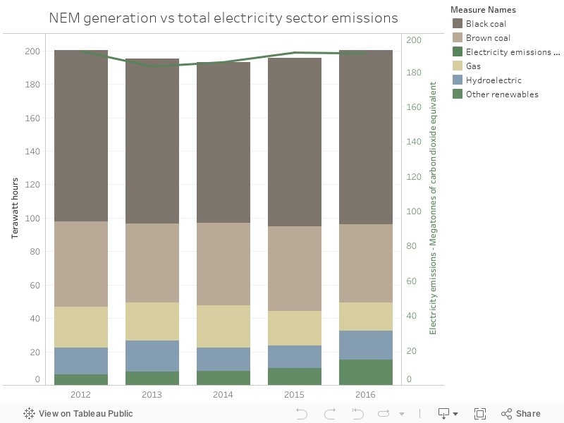
The chart below shows the generation mix vs the total emissions for electricity - which have increased as coal's share has increased, over the past few years.
Tuesday, 18 July 2017
084 - Change in emissions, by sector
Some recent news - the Australian Government Department of Energy recently released the 'National Greenhouse Gas Inventory' - a big, all-encompassing update of exactly how much Australia is emitting into the Earth's atmosphere through the operation of our economy. There'a whole stack of data in the December 2016 update.
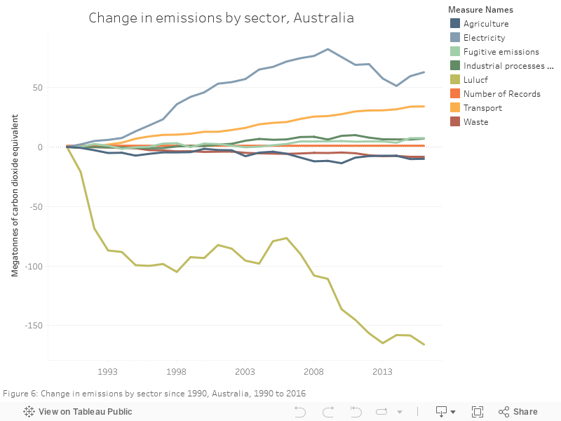
The chart below shows total change in emissions, by sector. Most interesting is electricity, which saw a period of decrease but has, in the past few years, started climbing back up again.
Monday, 17 July 2017
083 - Emissions by sector
Some recent news - the Australian Government Department of Energy recently released the 'National Greenhouse Gas Inventory' - a big, all-encompassing update of exactly how much Australia is emitting into the Earth's atmosphere through the operation of our economy. There'a whole stack of data in the December 2016 update.
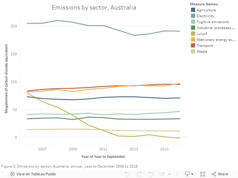
The chart below shows total emissions by sector, with a clear decrease in land use, and electricity still dominating all the sectors in totals.
Sunday, 16 July 2017
082 - Australia's increasing emissions
Some recent news - the Australian Government Department of Energy recently released the 'National Greenhouse Gas Inventory' - a big, all-encompassing update of exactly how much Australia is emitting into the Earth's atmosphere through the operation of our economy. There'a whole stack of data in the December 2016 update.
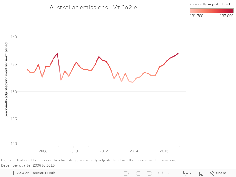
The chart below shows the total emissions from 2006 to 2016 - the latest figure, for Dec 2016, is the highest in the data set made available in the file.
Monday, 19 June 2017
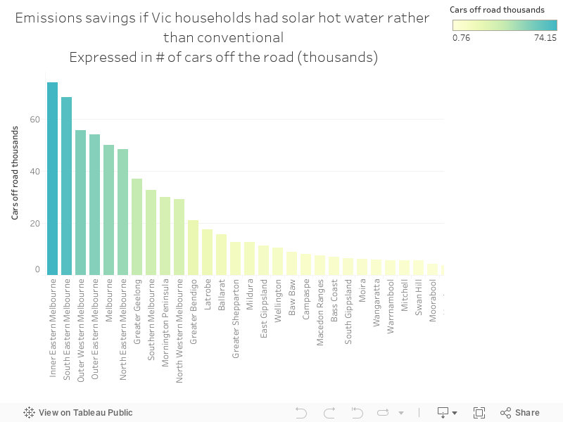
063 - Emissions reductions potential from Vic hot water
More data from Aus gov's great open data site - "Using data from the Bureau of Meteorology and figures from the Climate Group, the Solar Report shows the percentage cost and greenhouse gas emissions that households in Victorian regions would save on their hot water bill if they had a solar water heater"
The chart below shows emissions reductions in the total number of cars that could be taken off the road.
Sunday, 18 June 2017
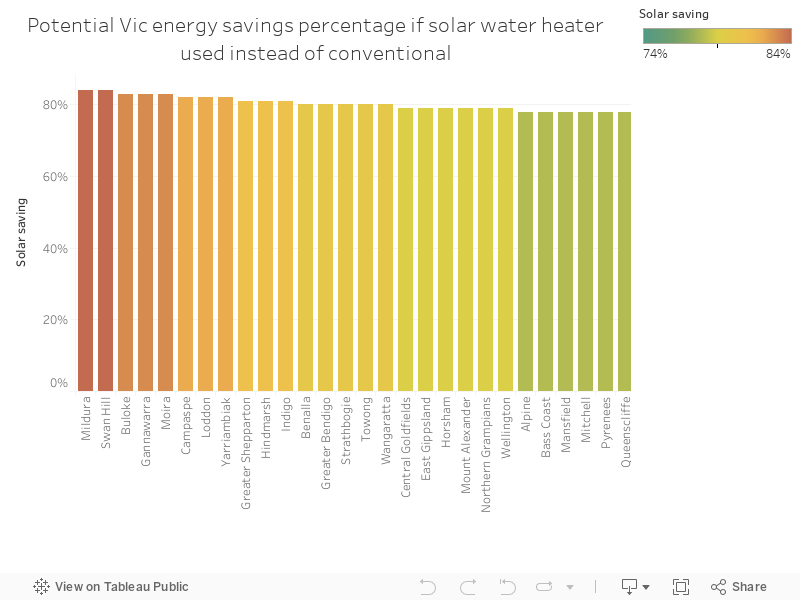
062 - The potential savings from new solar hot water in Victoria
More data from Aus gov's great open data site - "Using data from the Bureau of Meteorology and figures from the Climate Group, the Solar Report shows the percentage cost and greenhouse gas emissions that households in Victorian regions would save on their hot water bill if they had a solar water heater"
Go Mildura!
Go Mildura!
Thursday, 15 June 2017
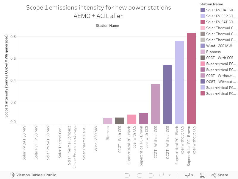
061 - Emissions intensity of new NEM generators
The Australian Electricity Market Operator has a database called the National Transmission Network Development Plan (NTNDP) database - the NTNDP is basically a report that looks at what future grid wires might look like. There are some detailed, fascinating data points underneath this report.
The chart below shows emissions intensity for new power stations - measured in the tonnes of greenhouse gases emitted for every megawatt hour of generation.
Tuesday, 13 June 2017
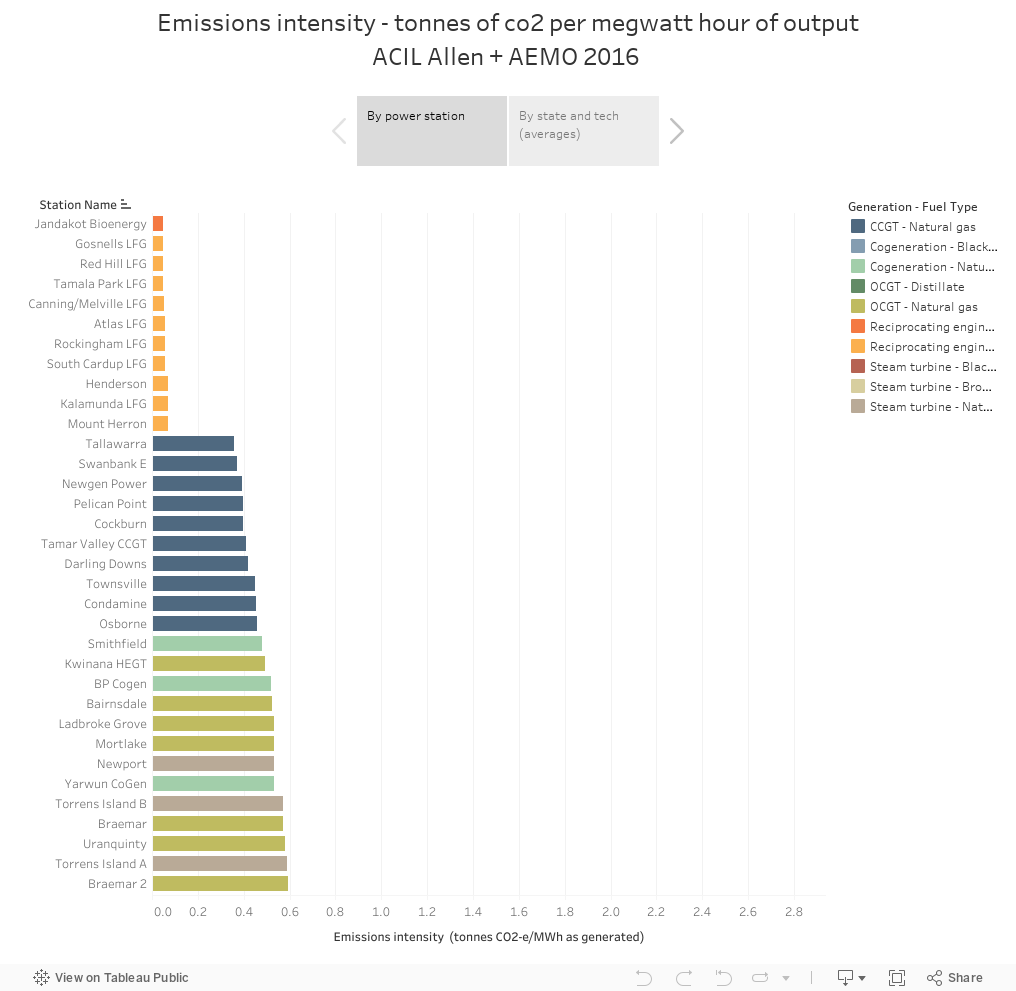
059 - Scope 1 emissions intensity for
The Australian Electricity Market Operator has a database called the National Transmission Network Development Plan (NTNDP) database - the NTNDP is basically a report that looks at what future grid wires might look like. There are some detailed, fascinating data points underneath this report.
The chart below shows emissions intensity - the numbers of tonnes of greenhouse gases that are emitted for every megawatt hour of generation from power stations - by state, and by individual power plants.
Tuesday, 23 May 2017
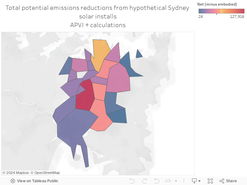
045 - Potential emissions reductions from Sydney solar
A fascinating study from the Australian Solar PV Institute and UNSW, supported by the NSW government, shows the potential for solar PV in Sydney's inner city suburbs, looking at all rooftops alongside a few interesting case studies.
The graphic below shows a calculation I've done of potential emissions reductions from usage of the technology across Sydney's suburbs, shown as a map - I've subtracted the emissions used in the manufacture of the panels as the researchers have done in the paper.
Sunday, 21 May 2017
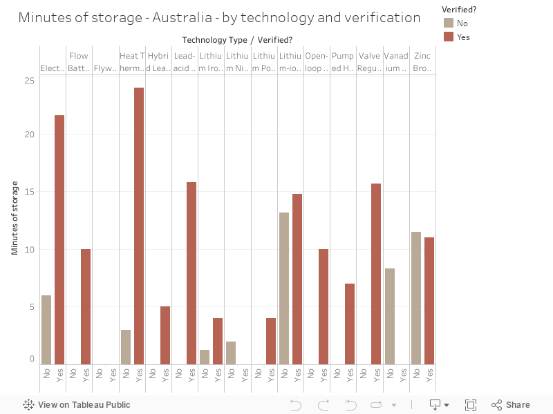
043 - Minutes of battery storage in Australia, by technology and verification status
The Energy Storage Exchange's storage database is pretty big - below, I've extracted technology type and verification status for Australia's energy storage.
Labels:
AESDB,
Emissions,
Energy_Industry,
Storage,
Technology
Thursday, 18 May 2017
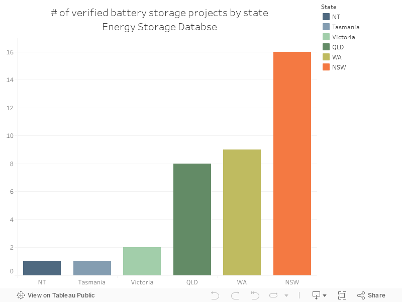
042 - Australia's energy storage projects by state
The Energy Storage Exchange's storage database is pretty big - I've sliced out Australia's storage projects and removed projects yet to be verified. Enjoy!
Wednesday, 17 May 2017
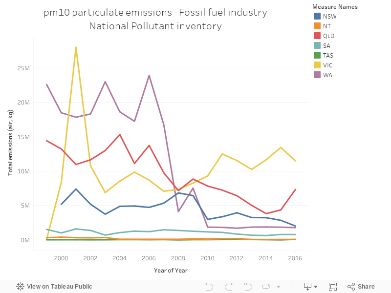
041 - PM10 emissions for fossil fuel electricity generation dominated by Victoria
The National Pollutant Inventory (NPI) is a truly gigantic dataset of air, water and land emissions from a bunch of activities in Australia. It's quite detailed - below is a chart showing PM10 emissions from fossil fuel electricity generation by state. Every state's decreasing with the exception of Victoria
Monday, 15 May 2017
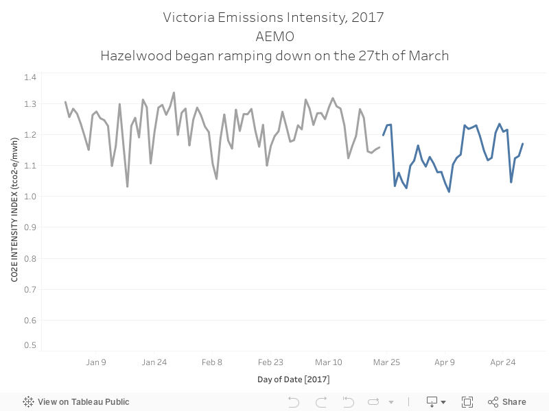
039 - Hazelwood's closure has impacted Victoria's emissions intensity
Almost all public discourse on Hazelwood's closure was about energy security and reliability - there was close to no discussion on how it'd impact emissions. Calculating the actual decrease would take some analysis, but AEMO's public emissions data shows that the intensity of emission, per unit of output, have decreased since the closure of Australia's oldest and dirtiest power station.
Labels:
AEMO,
Emissions,
Energy_Industry,
Hazelwood,
Intensity
Sunday, 14 May 2017
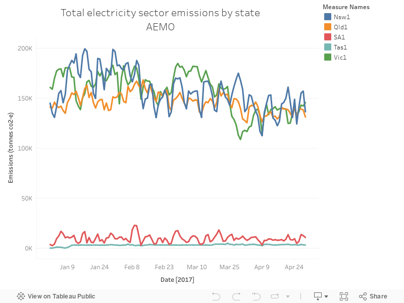
038 - NSW, QLD and Vic dominate Australia's emissions - by a lot
AEMO makes a bunch of data available on their website, freely. It's pretty good. You can download emissions data here - it shows, as you might expect, that NSW, QLD and Victoria dominate emissions - demand is the highest in these states. You can also see, in the chart below, how emissions decrease as we head into winter and air-conditioning stops pushing demand quite high.
Subscribe to:
Posts (Atom)