Wednesday, 23 August 2017

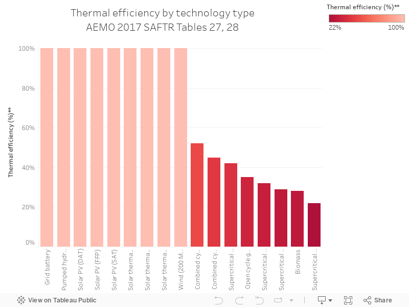
120 - 2017 Thermal efficiency by technology

Charts 116 through to 120 are a series from the Australian Energy Market Operator's South Australian Fuel and Technology Report, 2017, which can be accessed here.

The chart below shows the thermal efficiency of different technologies (sent out high heating value, HHV), which is basically how efficient the machine is at converting fuel to output.


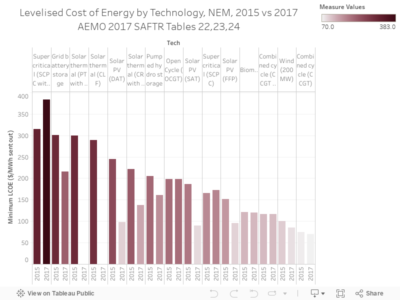
119 - Tech min LCoE, 2015 vs 2017

Charts 116 through to 120 are a series from the Australian Energy Market Operator's South Australian Fuel and Technology Report, 2017, which can be accessed here.

The chart below shows the levelised cost of energy (LCoE) by technology, comparing 2015 to 2017. Grid battery storage is up the top, but it's also seen the biggest drop in cost in two years out of all technologies.
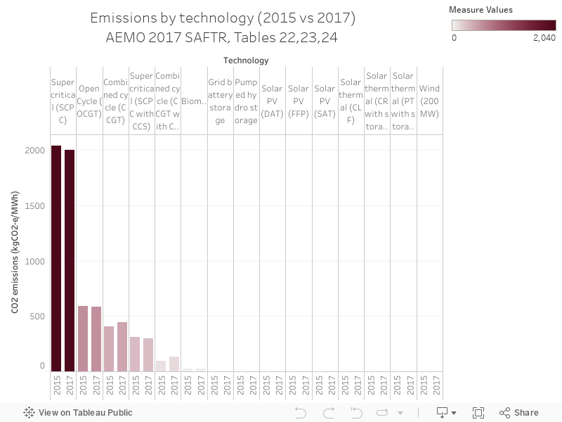
118 - Tech emissions, 2015 vs 2017

Charts 116 through to 120 are a series from the Australian Energy Market Operator's South Australian Fuel and Technology Report, 2017, which can be accessed here.

Today's chart shows emissions intensity for every unit of ouput by technology, with super-critical coal at the top of the the list.

117 - Installed capacity by physical attributes, NEM as at June2016

Charts 116 through to 120 are a series from the Australian Energy Market Operator's South Australian Fuel and Technology Report, 2017, which can be accessed here.

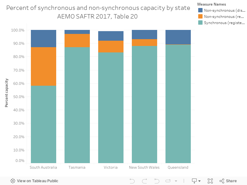
The chart below shows the spread of synchronous and non-synchronous generation across NEM regions, with SA having the highest proportion of non-synchronous generation.

116 - SA Coal resources map

Charts 116 through to 120 are a series from the Australian Energy Market Operator's South Australian Fuel and Technology Report, 2017, which can be accessed here.

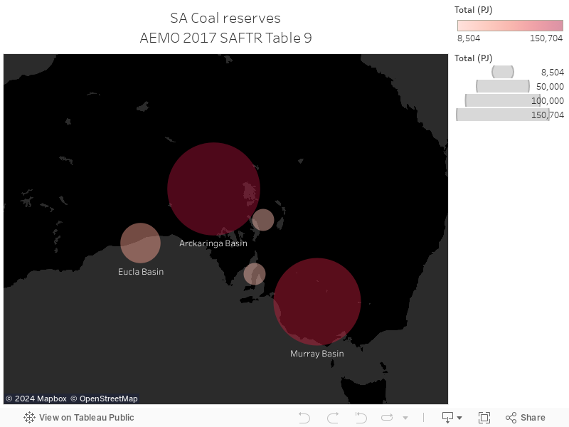
The chart below shows South Australia's coal reserves, Table 9 in the report.

115 - Mojave monthly capacity factor

Charts 106 through to 115 will be a series based on data from the United States Energy Information administration, with 108 to 115 focusing on solar thermal power stations in the US (South Australia just had an announcement about a big new solar thermal power station).

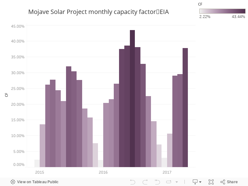
The Mojave solar project is another US solar thermal power station - the data below show capacity factor by month

114 - Mojave monthly output

Charts 106 through to 115 will be a series based on data from the United States Energy Information administration, with 108 to 115 focusing on solar thermal power stations in the US (South Australia just had an announcement about a big new solar thermal power station).

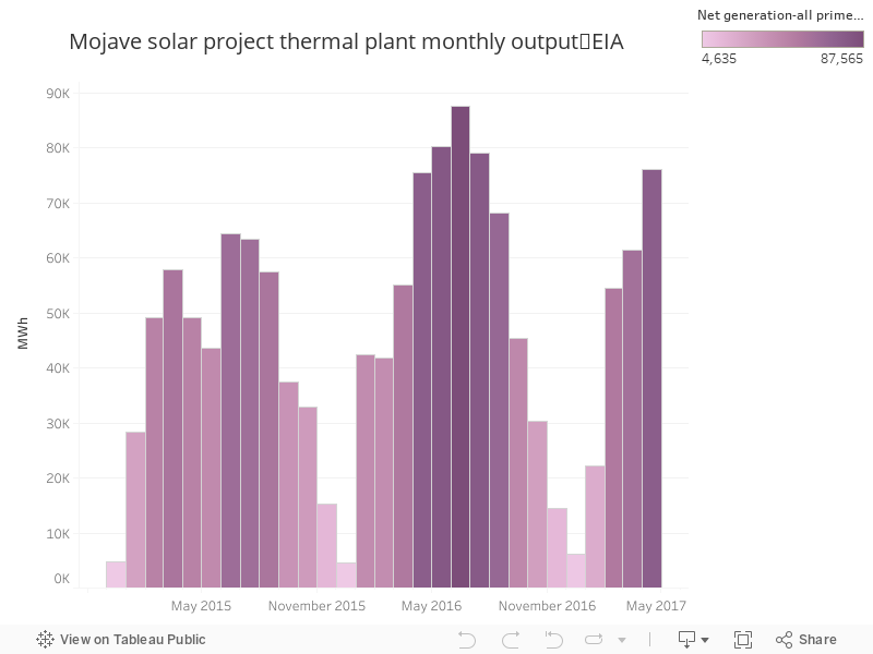
The Mojave solar project is another US solar thermal power station - the data below show output by month